In just a few short hours, I'm going to see a screening of
Milton Glaser: To Inform and Delight, a documentary about the work of one of my absolute favorite graphic artists. Inspired to share some design work from the film's key figure but assuming you've all seen the Bob Dylan poster and I Heart NY graphics 100000 times, I thought I'd post some illustrations from Glaser's partner at Push Pin Studios, Seymour Chwast.
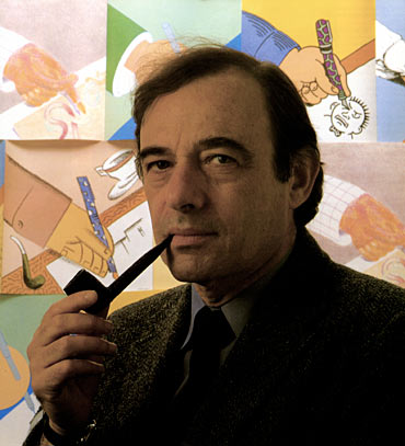
A gifted illustrator and designer, it's a shame that Chwast's name isn't more of fixture in the
Lexicon of Graphic Design Household Names (patent pending?). After graduating with a BFA from Cooper Union in 1951, he formed Push Pin Studios with fellow designers Edward Sorel and Milton Glaser in 1954. There, they designed everything from concert posters to identities to magazine illustrations to book covers to Happy Meals, always making time to release their design and art-related zine The Push Pin Graphic, the highlights of which have been compiled into a beautiful and strongly recommended
book of the same name.
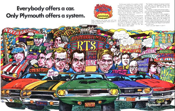
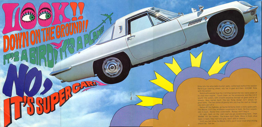
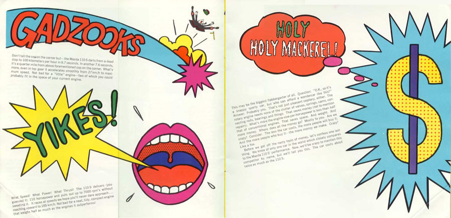
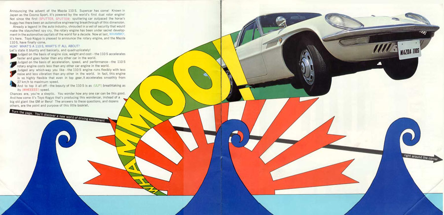
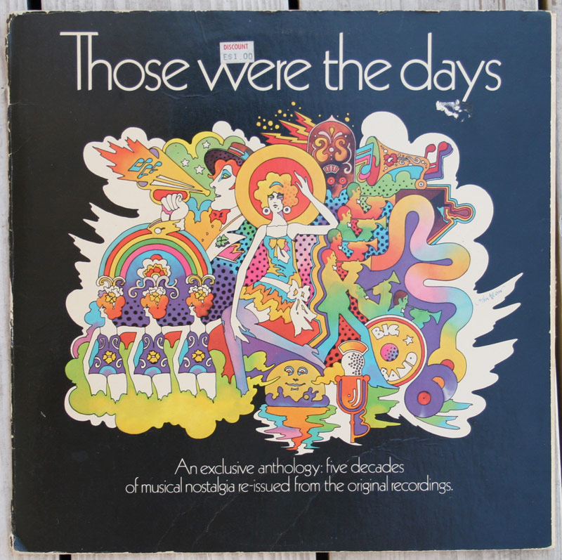
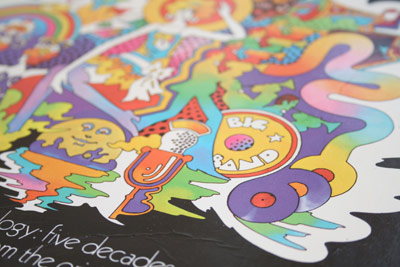
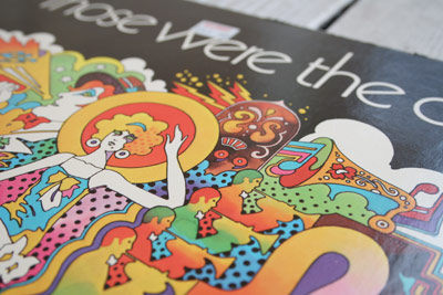
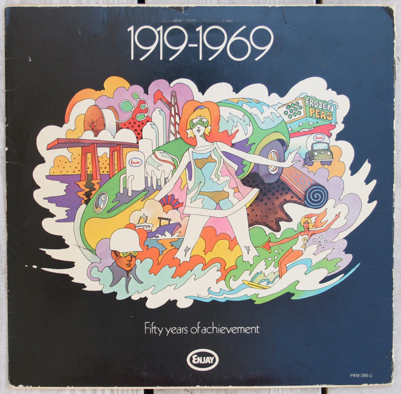
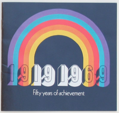
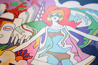
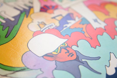
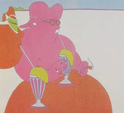
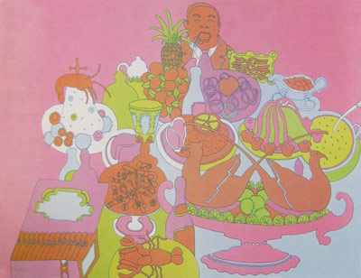
Here are a few illustrations drawn by Chwast for the 53rd installment of The Push Pin Graphic from 1967. They coincided with an article written on the topic of bizarre eating habits.
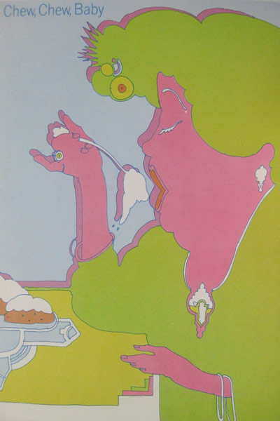
 Click for larger view