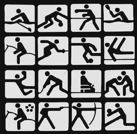
The symbols for the 1980 Olympic games, held in Moscow, were designed by Nikolai Belkow, fresh out of art school. His designs are more rounded out and smoothed than Aicher's, but are still very stripped down and stylized.
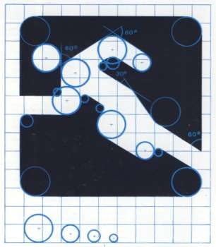
Check out this production sketch that gives a behind-the-scenes look at the skeleton of each illustration. Notice that the angles he's using (30 and 60º) are much less harsh and deliberate than the 45º angles used by Otl Aicher.

I'm also really into the logo for the '80 games, a nice answer to the '76 logo featuring the Kremlin clock tower:


a 1980 olympic poster I found in my junk
ReplyDelete