
That's right. Disney Week. All this week I'll be showing some well-designed Disney promotional material and merchandise from way back when.
We'll be taking a look at the fantastic graphics and typography used to promote their movies, theme parks, and other elements of their beloved and hated legacy.
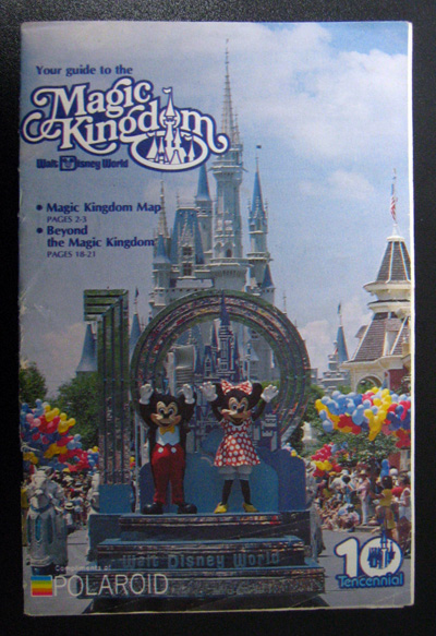
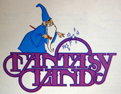
I'll start things off with a brochure from the Magic Kingdom, circa 1981.
Click for larger view

I heartily endorse this product and/or event.
ReplyDeleteFANTASY LAND WINS!
ReplyDeleteWOW! Disney Week... what a great idea!
ReplyDeleteMagic Kingdom brochure cover type is great.
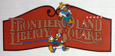
Fantasy Land, obviously great.
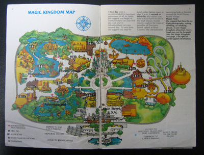
But the theme park map takes the cake. You're the only person I know who shares my obsession with theme park illustrated maps. I love the color scheme here and the twisted cartoony sense of scale. And I also love planning my imaginary day at the park!
Yes, wonderful idea friend. Love the idea of a Disney Week. Love the idea of an 'anything' week. Love So Much Pileup.
ReplyDeleteDisney has always had great design sense. One of my favorite things is looking at all the ornate design work and fonts found on the windows of Main Street. As a former Cast Member and current art director, I can really appreciate the time it takes to do such beautiful and authentic work. Thanks for showcasing all this amazing work.
ReplyDeleteJason