Hopefully everyone who reads this blog saw fellow designer
Justin Kay's thorough documentation of the incredible
Herb Lubalin Archives at Cooper Union in NYC. If you haven't, I can't recommend it enough. Justin spent several hours sifting through posters, books, and even original sketches from the man who I consider to be the greatest contemporary graphic designer and typographer.
He was kind enough to save a few photographs for this exclusive post on So Much Pileup, so make sure to visit his site and leave a comment here thanking him!
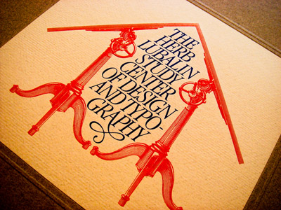 Click for larger view
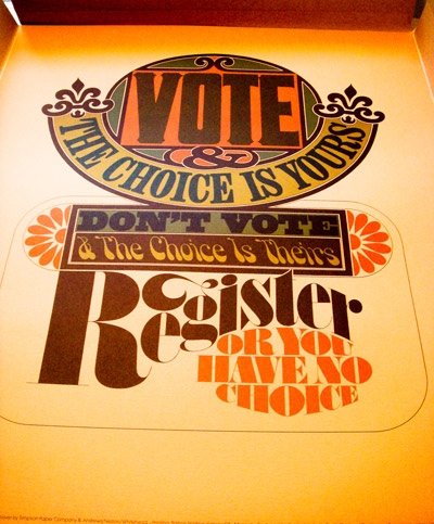 Click for larger view
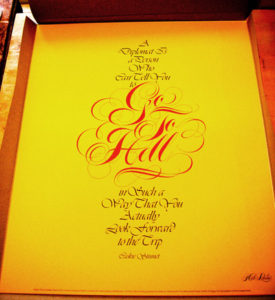 Click for larger view
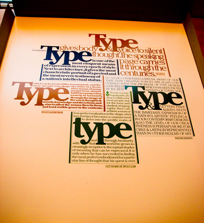 Click for larger view
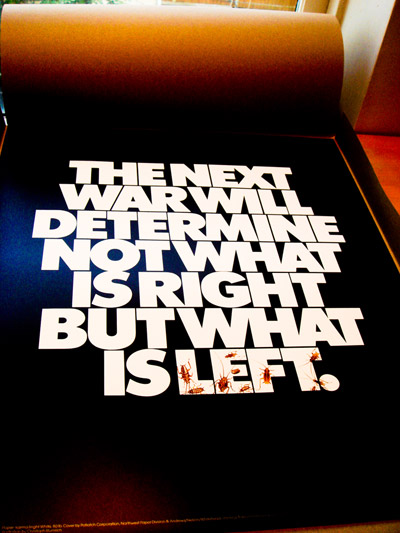 Click for larger view
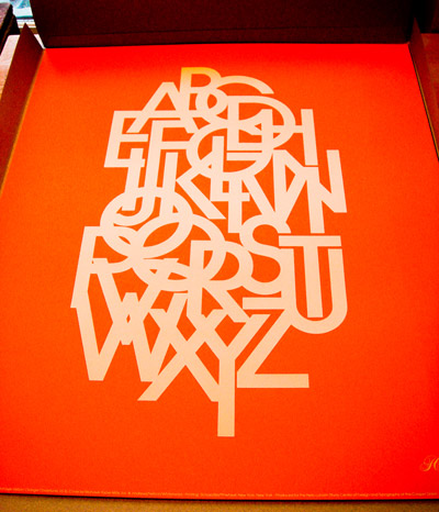 Click for larger view
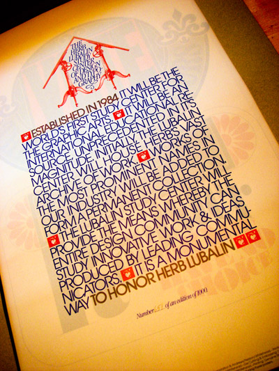 Click for larger view
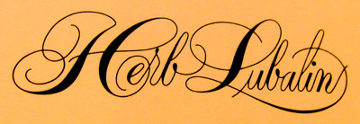


awesome....
ReplyDeleteI could stare at this post all day, look at that lowercase g, whoa. Thanks Justin you're like Moses coming down the mountain with commandments.
ReplyDeleteamazing. what's the font used on the 7th picture?
ReplyDeleteg - that's Lubalin's own Avant Garde (also featured in the orange alphabet design above it)
ReplyDeletethis is the best set of his posters i've seen in a while-nice big photos of them too, awesome!
ReplyDeletethanks Mike! and thanks again for posting these awesome pics.
ReplyDeletegreat design is timeless...i looked at Lubalins work in awe back in the 70s when i was first starting out in design. 30 years later, it still just amazes me....
ReplyDeleteso, so tough. thanks for sharing.
ReplyDeleteThanks a bunch for bringing us the goods.
ReplyDeleteThese are indeed beautiful!
ReplyDeleteThank you thank you thank you thank you! Thank you! Such a fan of his work. Thank you for making these available for everyone to see and enjoy! Thank you!!!
ReplyDelete