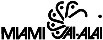
UNPRECEDENTED! It's fight night at So Much Pileup and we are thrilled to present our first ever Logo Wars handicap match! Our featured fighter is the logo for the nation's first and largest jai-alai center, Miami Jai-Alai. The clever use of the "J"s and the dot of the "i" combined with slick Avant Garde type make this one a tough contender.

Miami Jai-alai's opponents are the tag team of:
1) KALGLO: an electronics logo, using the same style of bold Avant Garde type and an illustrative electric burst inside the "O."

2) FORRESTER FLOWERS: Look out Jai-Alai, these "F"s can fit into a typographic illustration just as well as your "J"s can.

FIGHT!

MIAMI TAKES IT!
ReplyDeleteI'd go with the flower logo, because it's a logo and you don't have to read it. Instant recognition. The other 2 are too messy with their overlapping letters, forcing you to slow down and read it hunk-by-hunk, and the words are already uncommon words that the average person has to phonetically read to begin with. That's why the flower wins.
ReplyDeleteHands down the Miami jai-alia for me, even on it's own!
ReplyDeleteForrestor flowers! Jai-alai doesnt stand a chance
ReplyDeleteForrester Flowers.
ReplyDeleteThe first one looks like it says MVAMI.
Jai Alai, though I'd like it better if they left Miami off.
ReplyDeleteF-ing flower every time.
ReplyDeleteI'd go for that electronic logo since most of them picked that flower logo, just to make a difference, lol!
ReplyDeleteChess