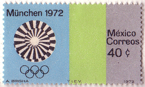
Otl Aicher's branding for the 1972 Munich Olympics is one of my favorite identity systems of all time. Here are some of those fantastic colors and graphics applied to a postage stamp from Mexico.

Click here to see more of Aicher's design work for the '72 Olympics.

totally found one of these tees lately! http://s3.amazonaws.com/files.posterous.com/temp-2011-09-08/tCfweAlAilCDqEiFmfhatJEIdzbyDeqcJhrgqtvrAjvlyvfdBIEBuAqgdAiy/72olympics.jpg.scaled500.jpg?AWSAccessKeyId=AKIAJFZAE65UYRT34AOQ&Expires=1318377079&Signature=6EIIH9DeqGb6X28f2NR1pABP0%2FM%3D
ReplyDeletemy blog: demploi.posterous.com