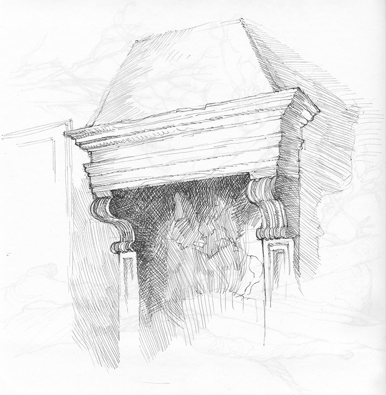
In a recent post, I showed the logo for the St. Paul Humane Society:

The logo was created by a designer named Richard Stanley. Very drawn to the logo and its Minnesota connection, I tracked him down and found that he was keeping himself quite busy during the 1970s, doing some top-notch graphic design work. Richard was kind enough to answer a few questions and share some photos of his old sketchbooks! I now present to you So Much Pileup's very first feature interview.
 How did you become interested in graphic design and when did you begin working in the field?
I was a “draw on the walls” kid in my Richfield (Minnesota) home with a commercial artist uncle to mentor me. When he moved to Spokane WA I spent summers in high school working in his art department learning paper plate printing, hand lettering, and watercolor painting. He said it was his job to “knock the stars out of my eyes” about commercial art. While I was attending the Minneapolis School of Art (later MCAD), I had summer jobs in industrial motion pictures, still photography, and film animation. My primary interest was in photography and film.

 What were some of your favorite projects to work on?
Over the years, I’ve had the most satisfaction working on corporate identity and museum exhibition graphics. Trademarks have always been like solving a visual puzzle with their potential interplay of word and image leading to a single statement. Museum graphics add a three dimensional as well as movement through time component to design that is both persuasive and informational. Both have required more organizational responsibility and an engaged consultative attitude. Outside of design, I’m very involved in photography and drawing.
Click drawings for larger view
 As many contemporary graphic designers, myself included, don't know what it was like to have been a designer in the pre-computer era, could you talk a bit about the process of taking a job such as a logo design project from start to finish without the aid of Adobe Illustrator?
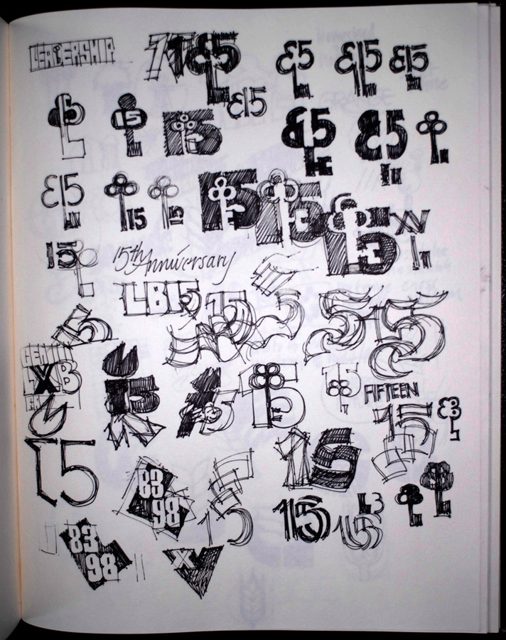
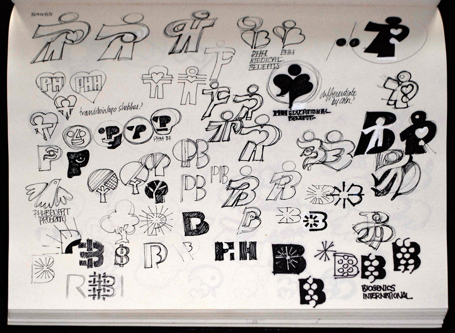
I don’t think there’s much difference in the “head work” of designing an identity even if the “hand work” has changed. I still need to do research about the client, immerse myself in understanding the nature of their business, and work cooperatively to create an effective solution. The hand work is somewhat different, but not as much as one might think. I have always spent a lot of time sketching and drawing a wide variety of approaches to a mark; often employing a semiotic analysis to find the best approach: word, image, or combination. Only after I’ve got a fairly good idea of what it will look like do I go to the Mac. Before the computer, everything would be drawn out in black and white paint Now I trace my sketches and refine in Illustrator.


 Richard Stanley's developmental sketches and final logo for G&K Services
 Click for larger view
 How has the computer changed the way you think about design and approach different design jobs?
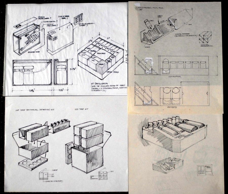
Very little. I don’t think of the computer as anything other than a capable tool. I can produce more, do more of the work myself (a mixed blessing) and complete jobs faster using the computer. It will never replace working in a consultative way with the client or hand drawing. I have always liked doing my own illustration and photography, so Photoshop is as much a necessity now as a digital camera.
 Click for larger view
 Click for larger viewWhat was some of your greatest inspiration back then and now?
While at the Minneapolis School of Art, my first inspiration then and until his passing was Rob Roy Kelly. He taught all of us to “save the world for design” and, for us, it was a real cause. Later, I went to Switzerland for grad studies with Armin Hofmann, Wolfgang Weingart, and Kurt Hauert, all of whom made a profound difference in the way I looked at design. They taught that design is a logical process, that creative analysis combined with careful attention to detail would produce the optimal solution. Finally, my continuing friendship with Dale Johnston, which started at Design Center in Minneapolis always put a human and compassionate face on design. Together, they have made continuing education a pleasurable necessity.
Thanks for taking the time to share your design work and insight Richard! Readers, please visit Mr. Stanley online at
swisstrix.com.