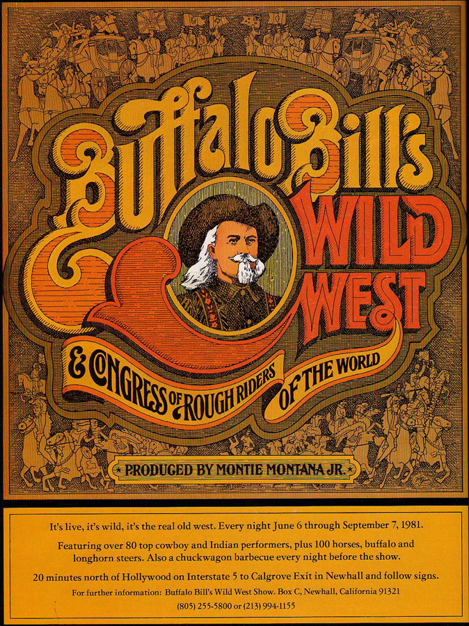
Here's a magazine ad for a rootin'-tootin' cowboy show. I love the chunky, late '70s illustration and typography style used to create an image so clearly "wild west" and how it fits together so effortlessly. There's something about the complexity of typography from the era just before computers came around that hearkens to the turn-of-the-20th century graphic arts. This image is so 1981 and so 1901 at the same time. Thoughts?
 Click for larger view