Friday, May 29, 2009
Philately Fridays: Switzerland, 1979
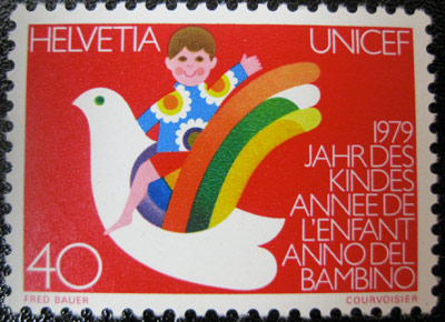
Something colorful to end this week on a high note. This is from 1979, or as they call it in Switzerland, "Year of the Child."
Thursday, May 28, 2009
Seymour Chwast & The Push Pin Graphic
In just a few short hours, I'm going to see a screening of Milton Glaser: To Inform and Delight, a documentary about the work of one of my absolute favorite graphic artists. Inspired to share some design work from the film's key figure but assuming you've all seen the Bob Dylan poster and I Heart NY graphics 100000 times, I thought I'd post some illustrations from Glaser's partner at Push Pin Studios, Seymour Chwast.

A gifted illustrator and designer, it's a shame that Chwast's name isn't more of fixture in the Lexicon of Graphic Design Household Names (patent pending?). After graduating with a BFA from Cooper Union in 1951, he formed Push Pin Studios with fellow designers Edward Sorel and Milton Glaser in 1954. There, they designed everything from concert posters to identities to magazine illustrations to book covers to Happy Meals, always making time to release their design and art-related zine The Push Pin Graphic, the highlights of which have been compiled into a beautiful and strongly recommended book of the same name.
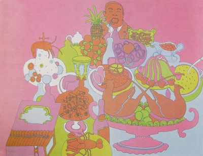
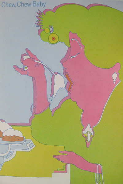
Here are a few illustrations drawn by Chwast for the 53rd installment of The Push Pin Graphic from 1967. They coincided with an article written on the topic of bizarre eating habits.
Click for larger view
A gifted illustrator and designer, it's a shame that Chwast's name isn't more of fixture in the Lexicon of Graphic Design Household Names (patent pending?). After graduating with a BFA from Cooper Union in 1951, he formed Push Pin Studios with fellow designers Edward Sorel and Milton Glaser in 1954. There, they designed everything from concert posters to identities to magazine illustrations to book covers to Happy Meals, always making time to release their design and art-related zine The Push Pin Graphic, the highlights of which have been compiled into a beautiful and strongly recommended book of the same name.
Here are a few illustrations drawn by Chwast for the 53rd installment of The Push Pin Graphic from 1967. They coincided with an article written on the topic of bizarre eating habits.
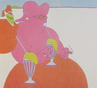
Click for larger view
Wednesday, May 27, 2009
OPP: João Lavieri
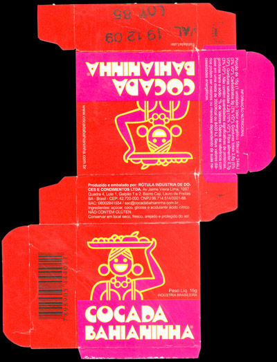
Pileup readers have been goin' hard with the guest submissions! This time we've got some coconut candy packaging from Brazil, sent in by João Lavieri. The colors are huge, the shapes are huge, there's nothing I don't like about this!
Click for larger view
Tuesday, May 26, 2009
OPP: Diego
Wednesday, May 20, 2009
Dial-a-tan
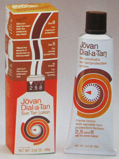
Love the product concept, love the color scheme, love the swirly tanning clock shape. This is great all around.
Tuesday, May 19, 2009
Flora & Fauna
Monday, May 18, 2009
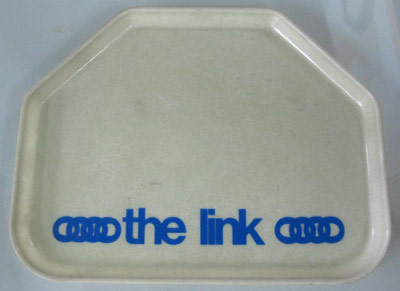
The Link
Apologies for the blog-slacking. Last week was crazy around the office as we were preparing for Friday night's Don't Sleep On it event with the Walker Art Center. Anyways, I've got tons of new stuff to share, so the updates should be happening much more regularly now!
Here's a cafeteria tray from the University of Minnesota. Not sure how they managed to get over on all of the cafeteria trays, but The Link was the U of M's magazine for the College of Education and Human Development which ran from 1984 to 2006. It's since been rebranded as Connect! Gotta love the clever angles cut into the corners to allow for four lunchers to eat together.
Monday, May 11, 2009
OPP: Danny Jones
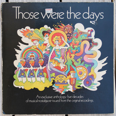
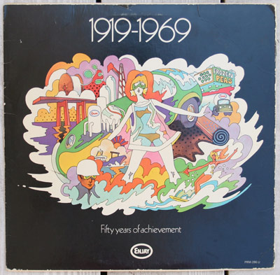
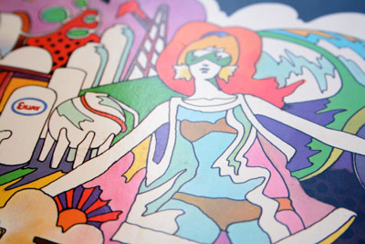
Today I'll be sharing a submission from Orlando FL's Danny Jones, the proprietor of and designer behind Yasly. <---- Click right there to see his portfolio, filled to the brim with fantastic colorful type-based design work for Nike, Burton, and many others. DO IT!
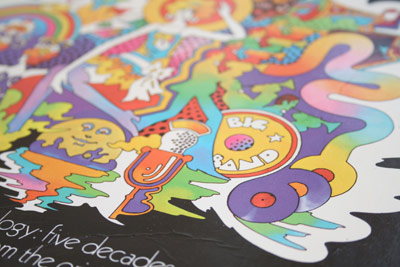
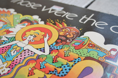
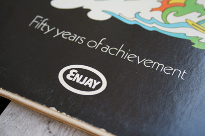
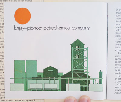
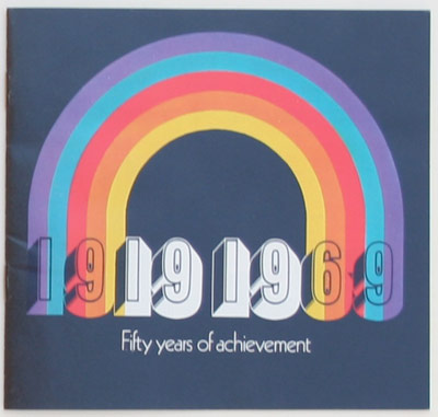
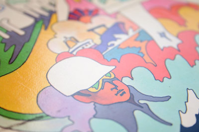
Danny sez: "Here's a little something I picked up from the thrift shop for next to nothing. I love the lush colors and free flowing lines in the illustration. It's like one giant party on the front and back cover! The little bookley inside, explaining what Enjay does, is a nice touch too."
Thanks Danny!
Click for larger view
Friday, May 8, 2009
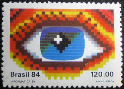
Philately Fridays: Brazil, 1984
Brazil abandons its usual loose, psychedelic visual rhetoric for this stamp designed in honor of computer science. Digital Big Brother is watching!
Tuesday, May 5, 2009
Repainting of the 53rd St. IND Station
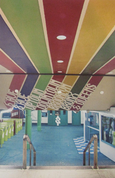
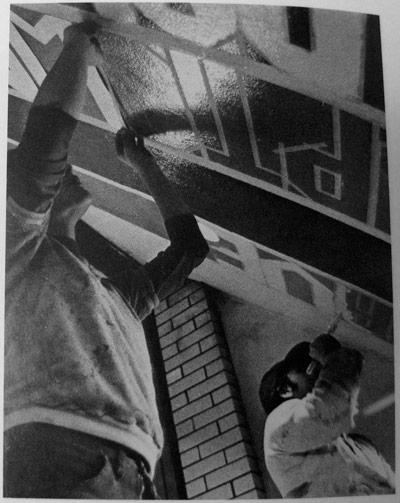
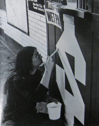
In 1977, graphic designer Robert Propper of Propper/Elman Design/Planning was among a handful of NYC designers approached by the Public Arts Council to redesign subway stations, transforming them from drab underground waiting rooms into vibrant public art spaces. Over the course of two weeks, Propper, aided by a small group of Pratt students and armed with paint, brushes, and masking tape, turned the 53rd St. IND Station into a colorful wonderland.
Subscribe to:
Posts (Atom)