Beautiful motion graphics piece for Brazilian television, 1983. The final frame is by far the best - a great illustration of Brazil made up of those rainbow stripes seen moving all around throughout the piece. I'd rock a t-shirt of that.
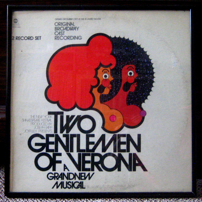
This is such a hot LP cover. Such a perfect combination of illustration and typography. Two Gentlemen of Verona is a musical written by Galt MacDermot (of "Hair" fame (I'm also a huge fan of MacDermot, "Hair," and all the weird versions of the soundtrack out there (I'll probably be showing a bunch of them on the blog in due time))). Art direction by Peter Whorf, design by Martin Donald.
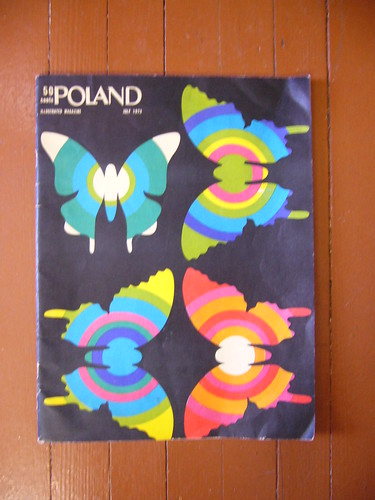
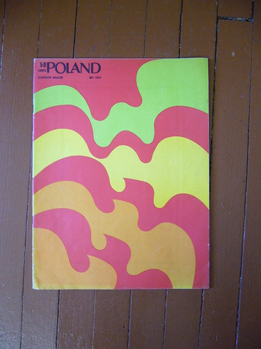
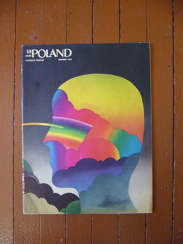
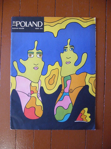
Today's entry comes from Milwaukee-based graphic designer and Pileup-reader Jeremy Pettis. Jeremy passed along these great magazine covers from Poland Magazine. I've never heard of Poland, but if we can safely judge the magazine by its cover, then they're probably really good reads. Anyone know anything about it?
Mr. Scien from the mighty 123 Klan hipped me to these great station ID animations from France's TF1 circa 1975 and '76 respectively. Check out the incredibly clever typography with the interlocking T, F, and 1 in the first clip and the funked out soundtrack and more futuristic vision from the '76 clip.
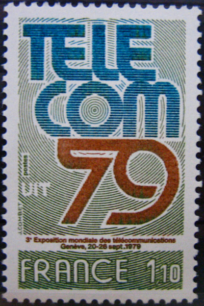
Thanks Scien! Check for the special French postage stamp on Friday in your honor!
I hope all of the American readers here have either voted or plan to go vote today.
Here's something topical... news footage from election night on 1972 Washington DC's CBS affiliate station WTOP. Never mind Nixon's victory, check out the super stylized typography and killer set designs.
This one is pretty scuzzy, but still worth watching:
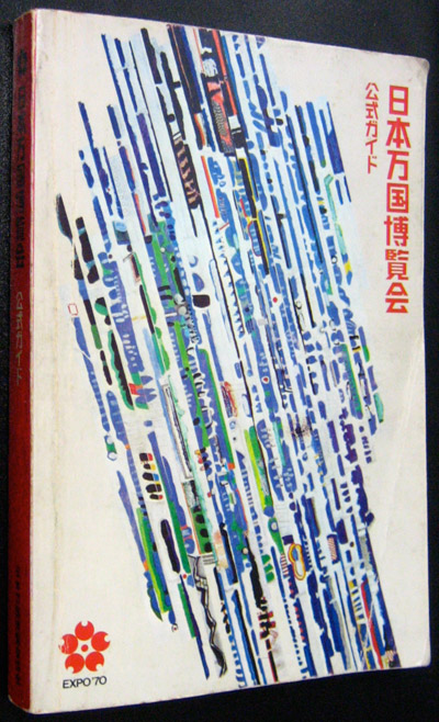
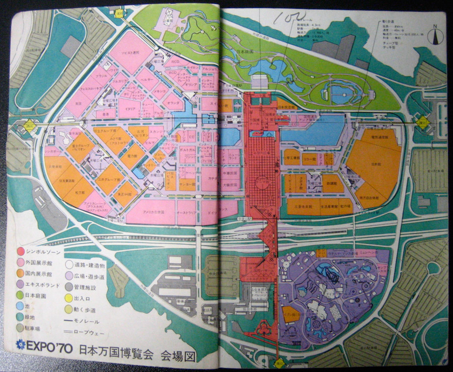
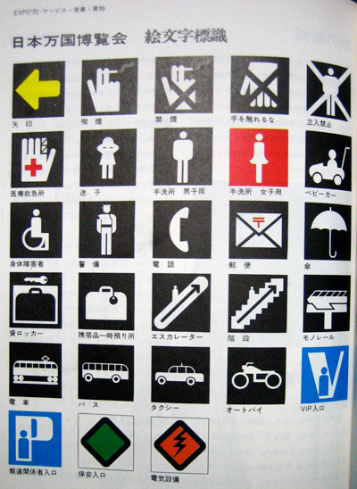
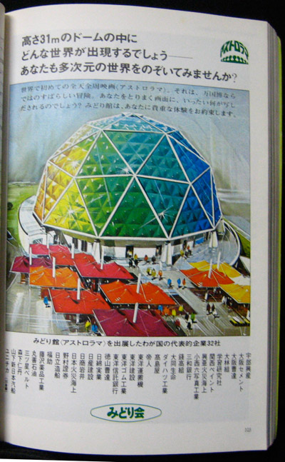
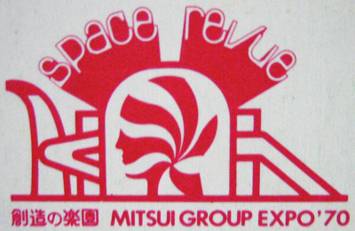
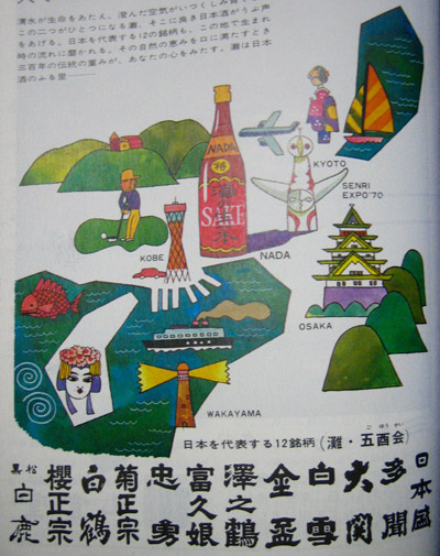
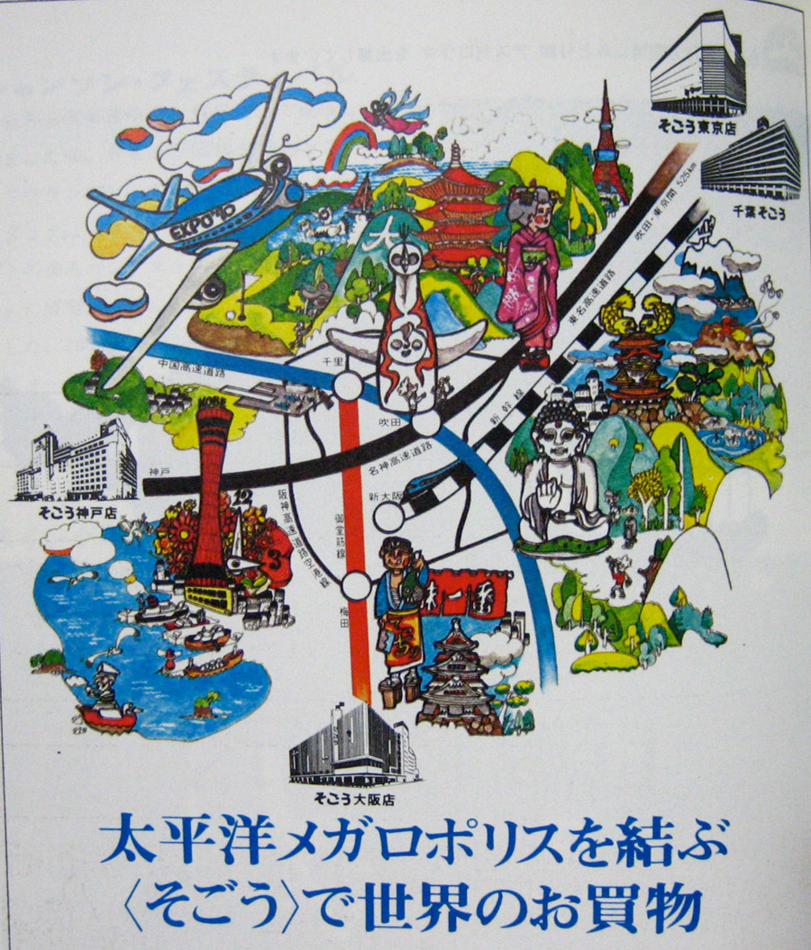
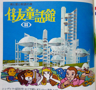
My good friend Chikara sent me this guidebook from the 1970 World's Fair and Expo, held in his hometown of Osaka Japan. The book is filled to the brim with watercolor illustrations of the different expo pavilions, logos and maps. I'm a huge fan of amusement park maps, so this was a real treat. Thanks Chikara!