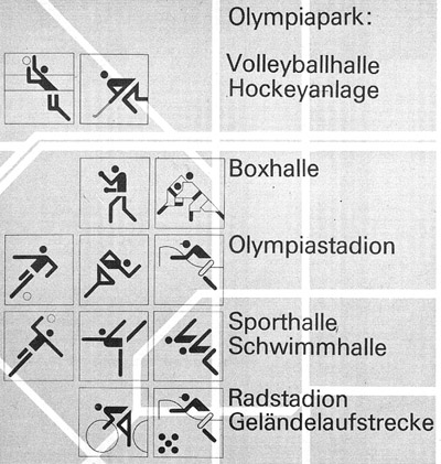
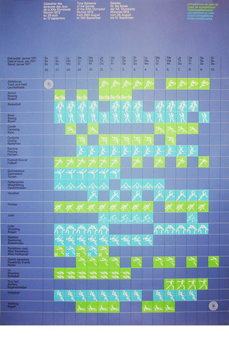
 Click for larger view
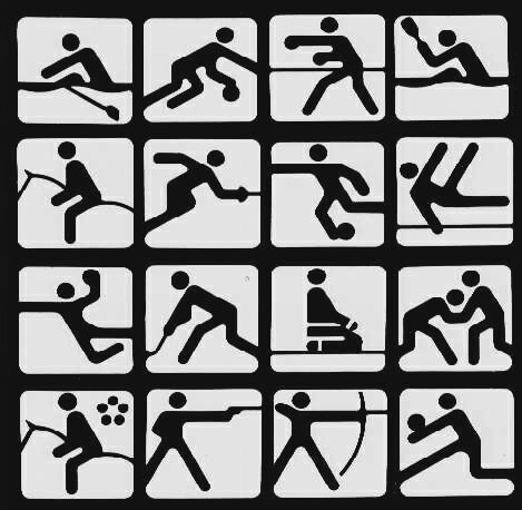
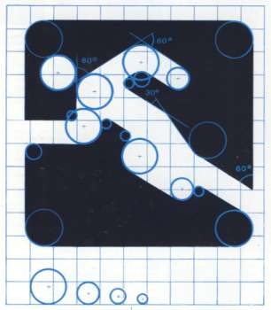
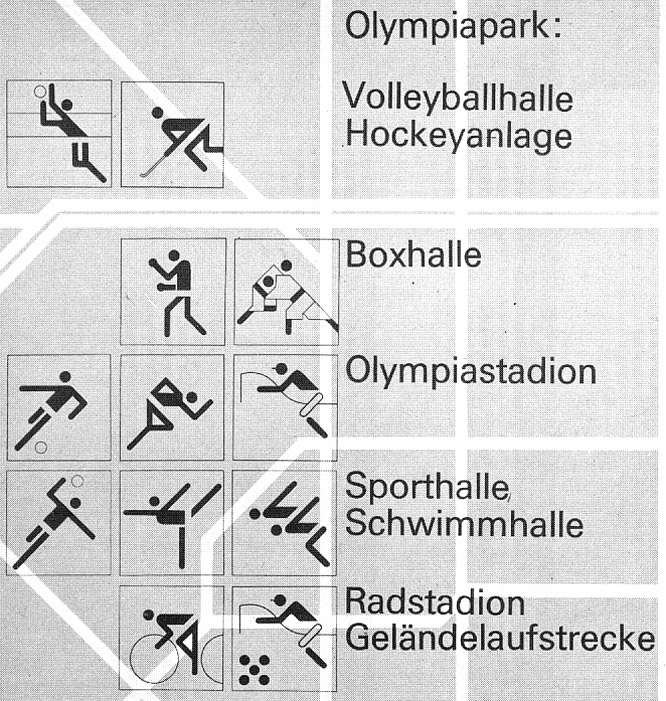
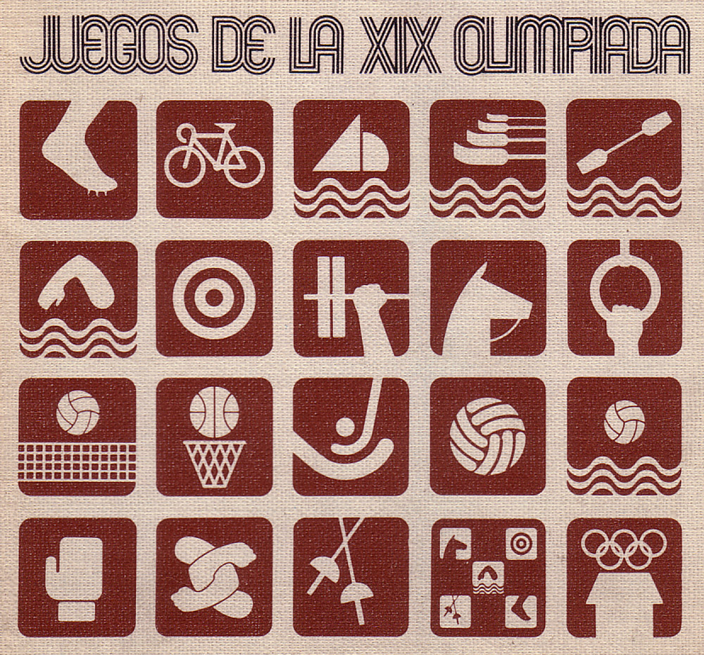
German graphic designer Otl Aicher brought the Olympic symbol design game to a whole new level with his designs for the 1972 games, held in Munich. His event icons have become, well... iconic, used and abused by designers and artists to this day. There's something so concise and finite about the way he captured each sport and represented it with a series of dots and horizontal, vertical, and diagonal lines.
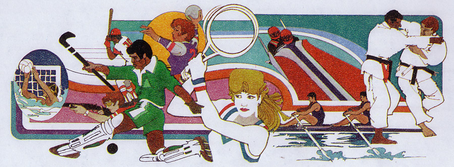
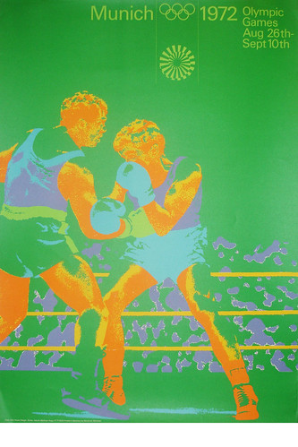
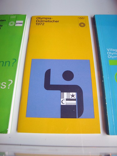
Aside from the pictograms, Aicher also created an entire universe of astonishingly gorgeous posters, brochures, and other printed matter for the games.
Oh and how about some Olympic event matchbooks?!?!?

Credits must go to the original collectors of these great items. Please check out the
Otl Aicher image pool on Flickr for more images and info!