
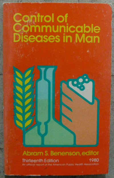
Lovely illustration with non-flamboyant Avant Garde typeface.
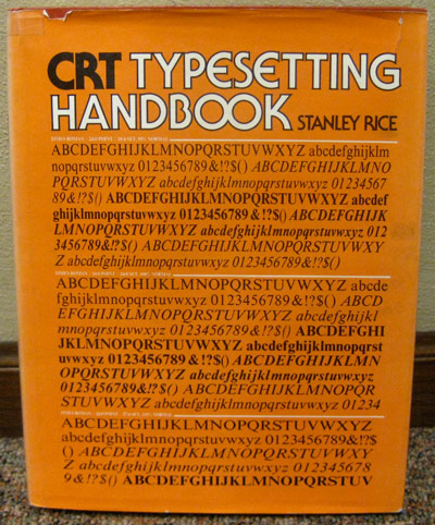
A typeface thesaurus with Serif Gothic (also designed by Avant Garde desiger Herb Lubalin) type for the title.
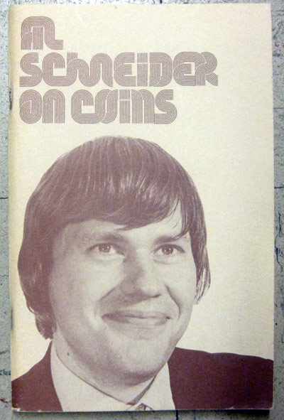
I thought this book was gonna be about coin collecting but it was actually a sleight-of-hand instructional manual. Hilarious. I can't remember the name of the font in the title but I think I have the Letraset sheet at home.
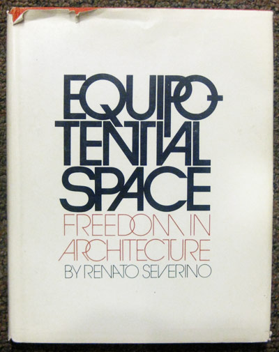
Whoever layed out this type HANDLED IT. So so fresh. This was also the first time I'd ever seen the word "equipotential."


7 comments:
very cool.
I really don't know how you find this stuff. Inspired by you, I've been searching used book stores here and am finding nothing.
I did however find this:
http://burlesquedesign.com/mike/somuchpileup/OPP/leon/thingsworkcover.jpg
at a little store that just has random stuff. I was very excited to find it. But I want more!
I guess you just gotta keep your eyes peeled open. For every Control of Communicable Diseases in Man, there are 1000 stale book covers not worth a second glance. Eventually you'll be able to scan the spines on a shelf and get an idea of what the cover will look like based on the type and color scheme just along the side of the book. That's how I found that Equipotential book - I noticed the Avant Garde type on the spine and figured the cover was worth checking out.
I still haven't come across a copy of that How Things Work book but I'd love to! One day!
The typeface on the cover of "Al Schneider On Coins" is called Stripes. Its not available in a digital form as far as I'm aware of, but its a really great font.
Also, Serif Gothic was actually co-designed by Herb Lubalin and Antonio DiSpigna.
Yes, I'm a huge typeface nerd.
I love this blog, by the way. Great job.
Funny you mentioned that - I just saw a Letraset poster yesterday that features all of their available alphabets. Lo and behold STRIPES is right there.
I've been reading about Tony DiSpigna alot lately (what little info there is to be found about him online) and was impressed at how much he kicked in around the Lubalin camp. You are indeed correct that he and Herb worked on Serif Gothic together.
Thanks Lamesville!
M
Nice to meet you.
alschneider.jpg is Stripes by Tony Wenman for Letraset in 1972.
http://new.myfonts.com/fonts/profonts/stripes/
Wow-I'm speechless
Post a Comment