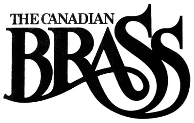
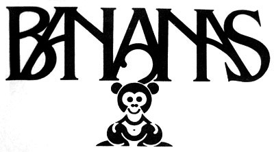
TCB by a long shot. It's a thing of beauty. It's sprouting tubas, fer cryin' out loud! The Bananas one doesn't even look like bananas or monkeys or whatever. Looks more like a logo for a Dillinger era getaway car.
TCB, only thing the bananas has going for it is the monkey tail A bar.
Canadian Brass!
definitely canadian brass. no contest. KO in R1.
Brass, duh.
I have to agree with everyone else on this one - the Canadian Brass gets my vote.
agreeeTCB
The first one is the most fonky !Who drawed it ?
The Canadian Brass just flows so much better. It's much more evocative as well.
Post a Comment


9 comments:
TCB by a long shot. It's a thing of beauty. It's sprouting tubas, fer cryin' out loud! The Bananas one doesn't even look like bananas or monkeys or whatever. Looks more like a logo for a Dillinger era getaway car.
TCB, only thing the bananas has going for it is the monkey tail A bar.
Canadian Brass!
definitely canadian brass. no contest. KO in R1.
Brass, duh.
I have to agree with everyone else on this one - the Canadian Brass gets my vote.
agreee
TCB
The first one is the most fonky !
Who drawed it ?
The Canadian Brass just flows so much better. It's much more evocative as well.
Post a Comment