Thursday, January 28, 2010

OPP: Jeremy Pettis gives us Tony Di Spigna!


Longtime Pileup reader Jeremy Pettis sent in these great examples of work from world class typographer Tony Di Spigna. Coming up in the 1970s working with Tom Carnase and Herb Lubalin, Di Spigna eventually started his own studio, Tony Di Spigna, Inc.

Here's a great pull-quote from the article...

"[Di Spigna] is amused by some clients who try to employ him on a sort of 'piecework' basis. If they have paid a certain price for, say, a four-word headline and they alter commission him to produce a two-word logo they will sometimes say 'But Tony, shouldn't it be half the price? After all, it's only two words.'

'These people miss the point,' says Di Spigna 'it's not the amount of words I'm charging for, it's the complete image.'"


Don't miss: Tony's zipper alphabet

Wednesday, January 27, 2010

The Shit is...


My man Blaine Rucker brought the ruckus right to my inbox with this one. No info on this one, so just sit back and enjoy it for what it is. Then go check out Blaine's collection of amusing and bizarro images at The Oro24K Tumblr.


Click image for larger view

Monday, January 25, 2010

Laissez Les Bon Temps Rouler

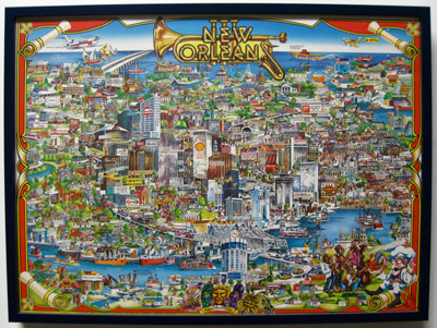
Everyone in Minneapolis right now is bummed the Vikings lost to the Saints last night and is probably bummed about New Orleans in general, so I want to share this poster to celebrate one of my favorite cities in the world. My dad grew up in the Crescent City, so I got to spend a lot of time there as a child, even living there for a year when I was 4 years old. It's impossible to visit New Orleans and not get mesmerized by the music, food, and people. I found this poster at my grandparents' house about two years ago. Fortunately their house was unharmed by the hurricane and I was able to pull all sorts of old magazines and books from there, several of which I've already shared on the blog.

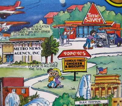
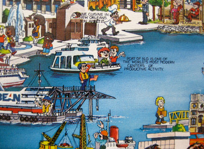
This poster, illustrated by the ungoogleable artist Gayle Grout in 1983, really captures alot of what I love about New Orleans. Have a look around...


Click image to enlarge


Friday, January 22, 2010

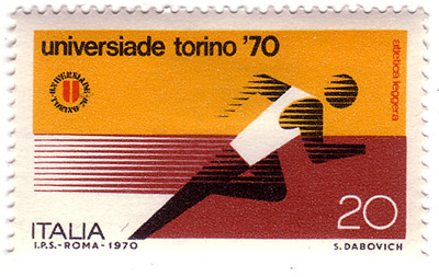
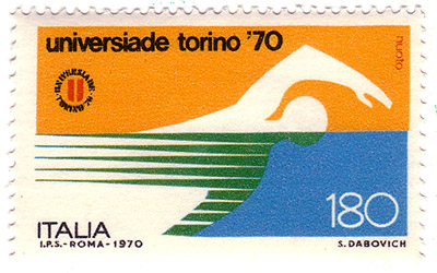
Philately Fridays: Italy, 1970


Check out this pair of stamps commemorating the 1970 edition of the Universiade, a series of competitive sporting events for Italian University students.


Friday, January 15, 2010

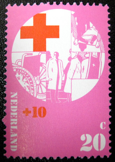
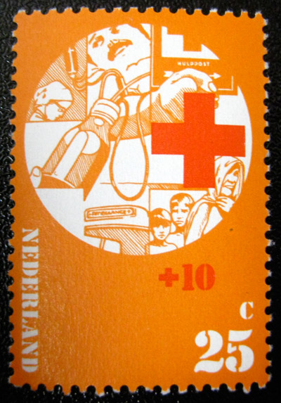
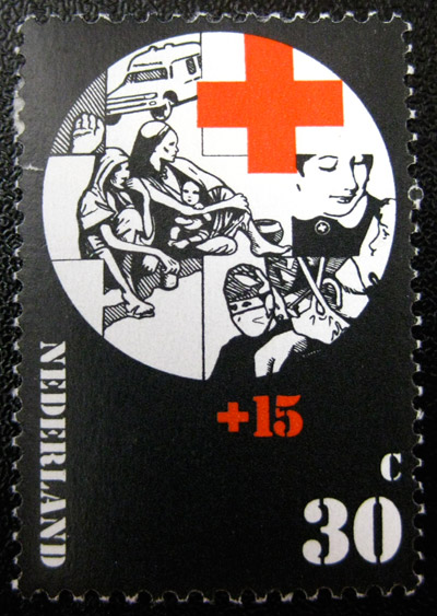
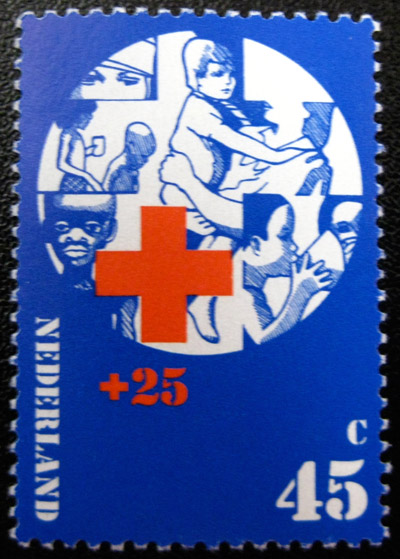
Philately Fridays: Netherlands 1972


I want to share this set of stamps from Netherlands created to promote the Red Cross. I thought it was only appropriate after this week when the notion of first aid seemed to be heavy on a lot of peoples' minds. I really love the illustration style and monochromatic color schemes in these.


Monday, January 11, 2010

Sendin' this one out to my man the Groove Merchant

...comin' through with beats books for which I been searchin'.

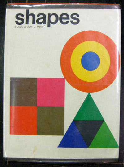
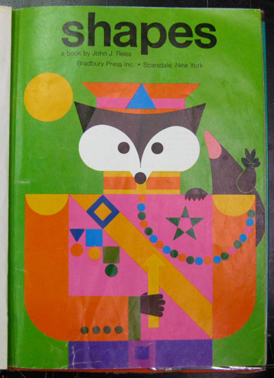
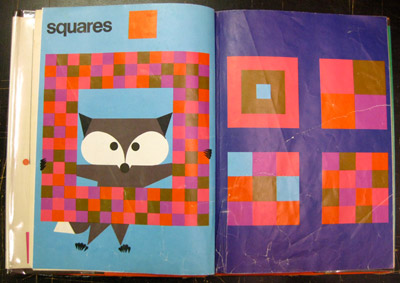
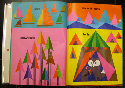
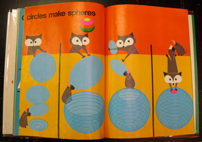
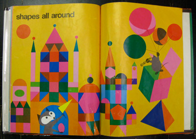
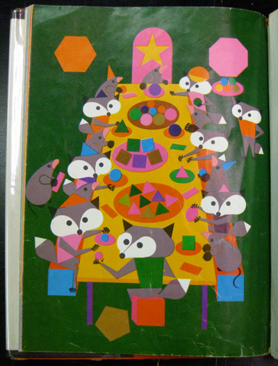
Extra special shout out to the one Cool Chris who hooked me up with this great children's book while I was in his store over the weekend. Written and illustrated by John J. Reiss in 1974, the book introduces basic shapes and shows some larger forms to be made from them, all hosted by a band of friendly forest critters.


Click image for larger view


Click image for larger view


Click image for larger view


Click image for larger view

Thursday, January 7, 2010

Exotic Island Spice Bath Soap by Christy

Kinda wishing I was on an exotic spice bath island right now instead of in the middle of this snow and shitstorm, but what can you do? This poster was designed around 1970 by American-born graphic artist Les Mason, who spent a good deal of his career and life in Australia.


Click image for larger view

Les Mason passed away in October 2009. You can read more about his life and work right here.