London-based type designer David Quay studied typography under Ralph Beyer, from whom he learned to pay extra attention to the negative space between letters, as that information will dictate how an entire piece of type will look. David always argued that beautiful type could be strong and expressive enough to stand on its own as fully-finished design. See some of his evidence below and I'm sure you'll agree.
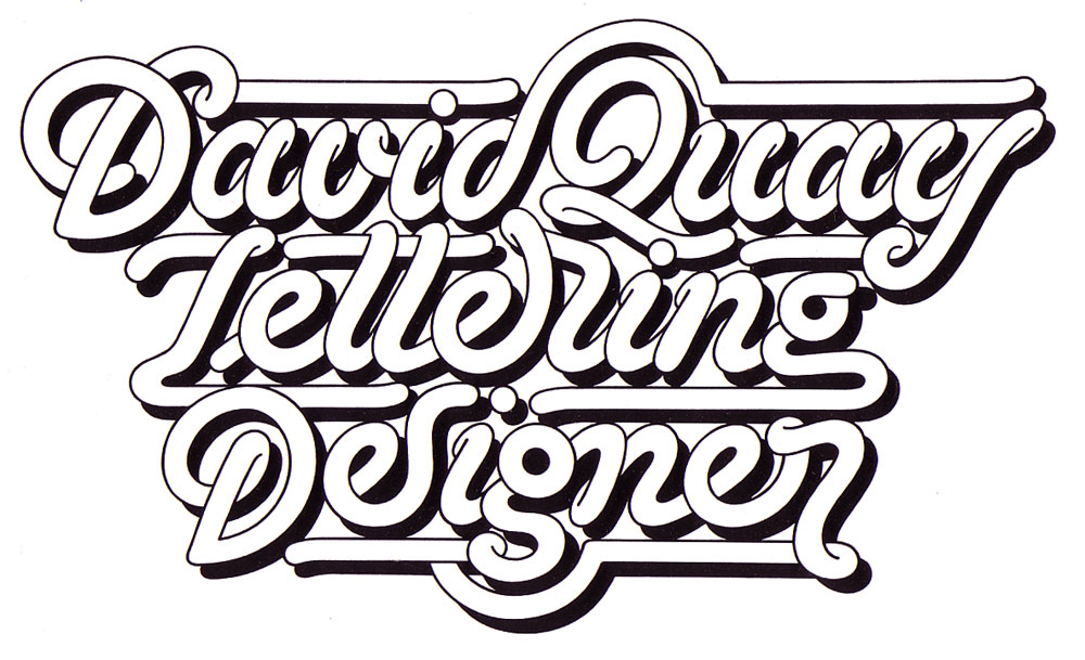 Click for larger view
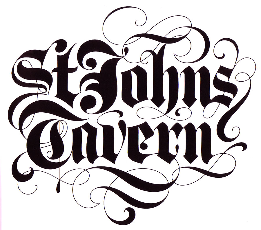 Click for larger view
 Click for larger view


No comments:
Post a Comment