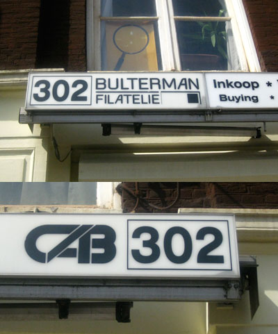
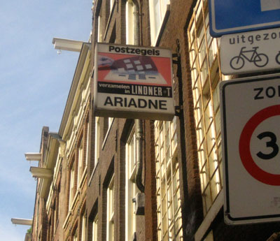
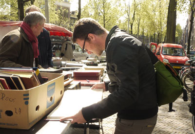
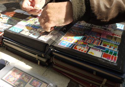
While in Amsterdam in early April, I was pretty excited to discover a small cluster of shops specializing in old coins, postcards, and most importantly, vintage postage stamps. If that weren't enough, each Wednesday morning, local stamp and coin dealers set up booths about 20 paces around the corner from these shops and sell their goods. I'm used to crotchety record dealers who hardly make up in tact what they lack in hygiene. By way of comparison, these Dutch stamp dealers were all super friendly and the general atmosphere of a stamp sale was much more enjoyable than that of a record fair. Here's a small sample of the great stamps I came up on at the market and surrounding shops.
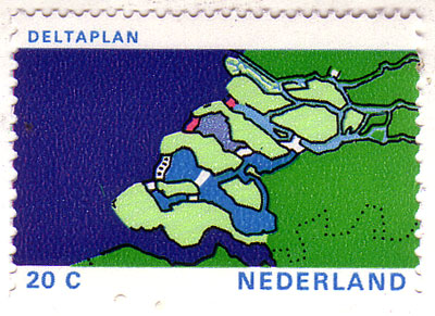 Netherlands, 1972
Read about the
Delta Works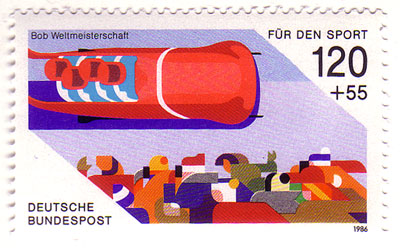
 Germany, 1986
I finally foud the other two stamps from
this set I featured two years ago.
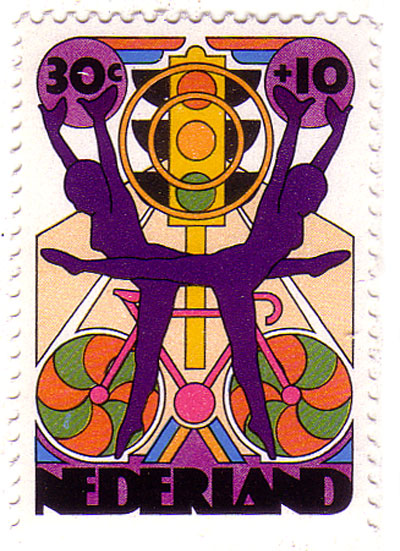
 Netherlands, 1974
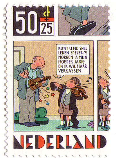
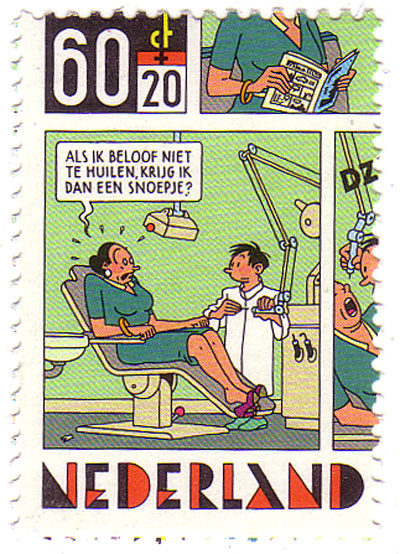
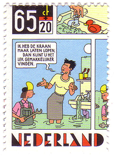
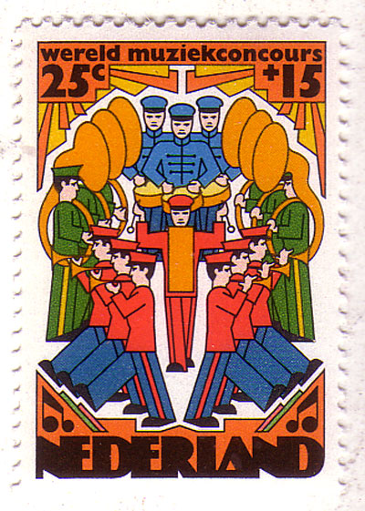
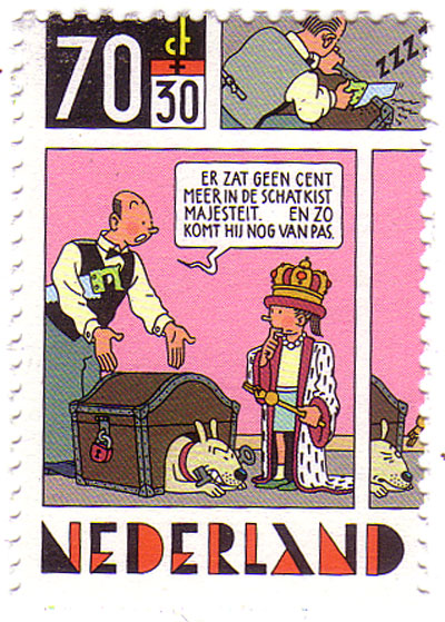 Netherlands, 1984
Four stamp set from Dutch comic artist and master of the "clear line" style,
Joost Swarte.
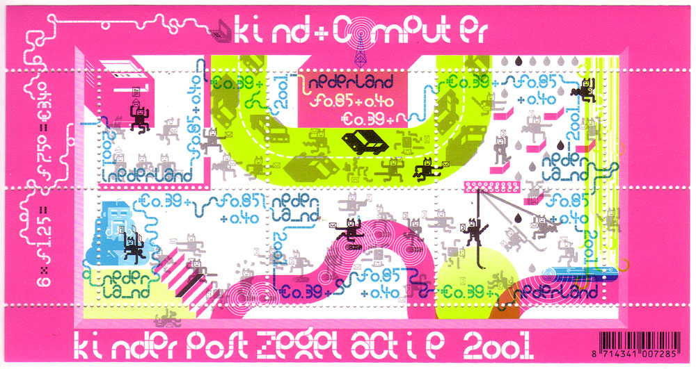
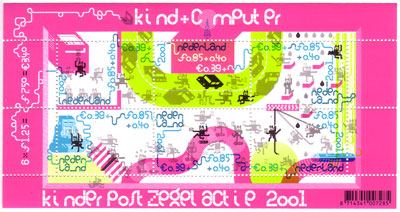 Netherlands, 2001 / Click image for larger view
Six stamp set by Dutch graphic artist and screenprinter
Harmen Liemburg. While we were visiting his studio, Harmen mentioned this stamp set he had designed and I was really happy to find it in the first shop we set foot in.
If you're ever in Amsterdam on a Wednesday between 10am and 4pm, I recommend stopping by the Postzegelmarkt right
here.