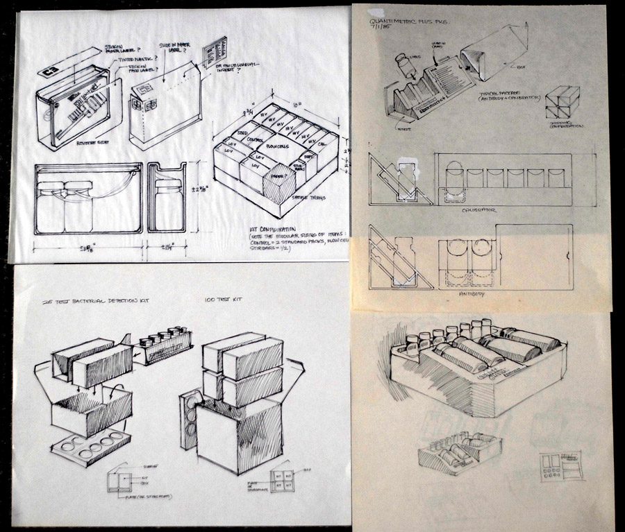
Whether we know it or not, we all grew up with Michael Manoogian's design work in our lives. Since the late 1960s, Manoogian has been hand-crafting stunning and time-tested typographic logos for clients in the music and entertainment industries. In May 2011, his name appeared in my email inbox. Out of the clear blue, this legendary letterer had written to express his appreciation for my So Much Pileup blog. I humbly asked Mike for an interview for the site and, not only did he oblige, but he was also generous enough to send over a large number of his original sketches from some of his projects. And now, with no further ado, I present this exclusive interview with the great Michael Manoogian.
Please introduce yourself and explain what you do.
I fell in love with graphic design while studying at Rhode Island School of Design. I’ve been involved with it ever since. I dabbled in everything there, design-wise – posters, book covers, ads, photography. But it was lettering that caught my interest the most. On a scale of 0-10, interest is at the top.
Interest is what gets you out of bed in the morning. The passion you feel carries you to new discoveries, new creations. Without it life becomes a chore. I’ve been designing lettering and logos for the last several decades. It never gets old.
Do you think Mozart wrote all that beautiful music without being interested, or Beethoven, or Picasso, or Lubalin or Da Vinci or or or…. Not a chance in hell! They all had to be incredibly interested in what they were creating. Total absorption. It’s what carried them forward. I say this not to sound profound or anything. I just want to express it as fact. It’s a rock bottom basic reality. Without it, you wouldn’t build anything, and anything you started building would end up half-done and abandoned.


What is your earliest memory of being fascinated with typography or the graphic arts?
The first time I ever did any real calligraphy was my first year at RISD, 1958. I learned how to cut a nib from a reed, fill it with ink, and make my first letter. It seemed simple enough. But, as soon as I put pen to paper something magical happened to me. It opened up a whole new world of passion and interest. Anybody worth his integrity HAS to follow his passion.
I distinctly remember the fascination I had with lettering earlier than that. I was about 7, watching a man draw letters. I was totally absorbed. And stood there and watched him for hours. I couldn’t take my eyes off what he was doing. It was that fascination that awoke several years later at RISD.
Can you explain your process of working with a client and moving from the initial meetings up through the finished logo?
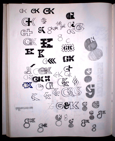
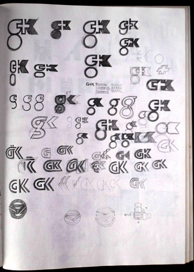
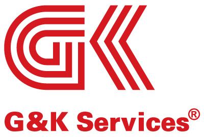
My process of working with a client is pretty simple – we’ll have an initial meeting, the more informal the better. We find out about each other, establish a nice rapport. That’s very important for me. He goes over the assignment. Then I’m off to my studio and quickly get to sketching ideas and concepts. With his input fresh in mind the ideas start to come pretty effortlessly. There is no shortage of ideas, 10-20-30, sometimes too fast to keep up with sketching them all. The “blank canvas” doesn’t scare me one bit. Actually, it’s an invitation to create. I bring the ones I really like to another meeting and we discuss what the best solution would be for his purposes, his company.
I do the finished art. That’s all there is to it. Simple – I hate dog and pony shows.

So much has changed in the world of graphics arts in the 40-some-odd years since your career has taken off. How have you adapted not only to the new techniques of creating digital artwork, but also to the new applications for viewing it (the internet, branding and logo infestation everywhere, etc.)?
Creativity, inspiration, artistry, exploration, inventiveness never change. Only the tools. We all have limitless creativity. It’s a matter of how much of it you can mine. How able you are at tapping into it, digging it up.
I spend my time at the sketch pad. Lots of time! After I get approval on THE logo I do a careful drawing of it. When I have all the elements exactly as I want them I scan it and send it to one of my pals who traces it in Illustrator. This goes back and forth a few times until he’s nailed all the nuances. That’s the extent of my knowledge of using the computer. Call me an old dog, but the technique never interested me much. The creativity did.
There’s really been a recent revival of the hand-drawn style you helped popularize in the late 1980’s.

...I mean, that Ninja logo is so iconic. How do you feel about it coming back around today?
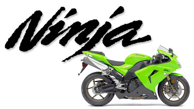
If it left, it was only until clients and the graphics community realized that no computer can match wits with us humans. I understand the fascination with this new tool. When the novelty wore off we got back to basics.
It was a human who invented the computer. So, we are the boss of computers. We tell it what to do! When we allowed the computer to dictate to us is when you saw all these cold looking things it spit out. It got so prevalent that when I got an assignment from a new client, the only thing he told me was that he didn’t want it to look like a computer did it. Smart client.

Designers nowadays are looking back for inspiration to work which you and your peers were doing just before the dawn of the Macintosh computer. Who did you look up to as an up-and-coming designer?
While at RISD, the class took a field trip to the Boston Museum of Art to view an exhibition of Hermann Zapf’s calligraphy. I couldn’t get over how incredibly beautiful it all was. I learned a lot from that consummate master. It actually took my breath away. I didn’t want to leave.
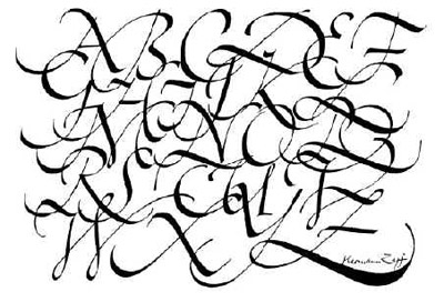
Calligraphy by Herman Zapf
Herb Lubalin was another inspiration, the way he made sense of typography. It was not just good looking, it communicated! It made an impact. And in the commercial world what you need to do is create an impact on the viewer. Otherwise, it fades into all the noise of sameness and goes unnoticed.

Bob Cato was a grammy-winning (Bob Dylan, Barbra Streisand) art director/designer at CBS Records in New York. I met him later when he was living and working in LA. I was a young artist just trying to get some work. He saw my portfolio and said “Hey, you got something, kid.” I did a lot of lettering for him. He also knew “everybody” in town and introduced me to all the art directors at the record companies. That’s how I got into the music industry.
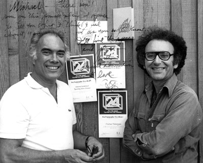
Bob Cato (L) with Michael Manoogian (R) in 1977.
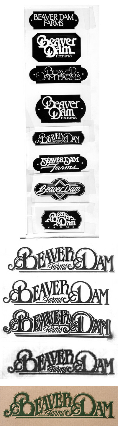
There were a handful of us doing a lot of work back then, mainly in the music industry. The brothers Vigon, Jay and Larry, were doing some real cool things. Check out what they did for Fleetwood Mac!
Tom Nikosey was (is) fabulous. As prolific as they come. You should see his latest art!
Then Margo Chase came along a bit later and wrote several new chapters herself.
They were all innovators. Not a wannabe among them.
Any interesting stories from getting to work with any of these big name musicians that you’re allowed to share?
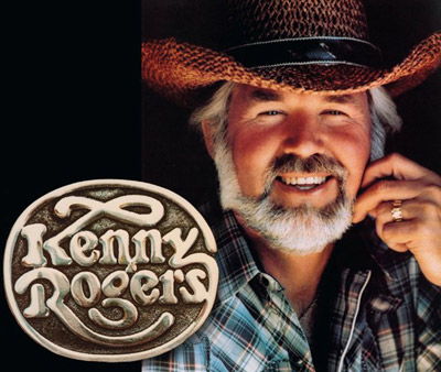
Ken Kragen was Kenny Rogers’ manager and boosted Kenny’s career to dizzying heights. He asked me to design a logo for Kenny. Out of the pile of sketches I did Kragen zeroed in on one and immediately knew it was the one. I met up with them when Kenny was doing a taping of the Dinah Shore show. I learned from Ken that Kenny was a little hesitant over adopting it and was going to try to talk him into it. I saw Kenny in the dressing room and brought up the fact that if he was hesitant, he shouldn’t take it. I could always do more ideas. After all, it’s your logo and you should love it. Well, he grew to like it and used it for years on everything.
Huge lesson I learned: “don’t resist.” Don’t resist rejection. Just don’t resist anything. If you do you run right smack in the face of it and that collision creates some bad energy, bad vibes. If you don’t resist, the thing runs right on by you and disappears into a nothing. It’s some law of the universe... “What you resist smacks you upside the head.”
Don’t ever include an idea you don’t think is stunning. The client can always be counted on to pick that very one. Why? That’s the one you resisted him picking! Don’t present any idea you wouldn’t be proud to sign your name to.
-----------------
Dolly Parton. I had done a logo for her first cross-over album “Here You Come Again.” It came time for her next album and I met her at the photo shoot to show her a logo I had prepared for her album. She remarked, “Well, I do like it but I want to wear this for a while longer.” At which point she raised her wrist to show me a diamond-studded bracelet she had made of the first logo. She went on to use that logo for years. It recently showed up again on a box set of her recordings.
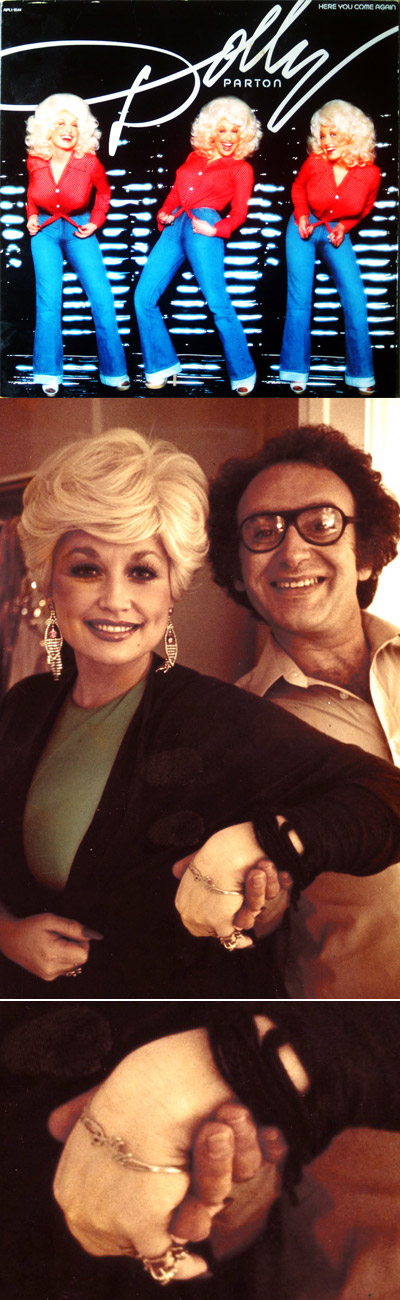
Dolly and Michael at the photo shoot in 1978.
---------------
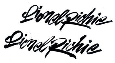
Ken Kragen. He managed a lot of artists. Kenny Rogers, Lionel Richie, Rich Little, Gallagher, Travis Tritt, on and on. He knew the power and value of logos. Whenever he signed up an artist he would call me in to design their logo. I’d bring a ton of sketches to his office. He would lay them all out on his floor and we’d sit there like kids and go over them. Sometimes it would be funny to me because he might take a phone call from Lionel Richie, then he’d get back to the sketches and his secretary would tell him Willy Nelson’s on the phone, can you take it or do you want to call him back. There I was, this skinny kid from Milford, a small town in Massachusetts, in the middle of all this star stuff going on around me. I kept thinking “someday they’re gonna find me out.”
---------------
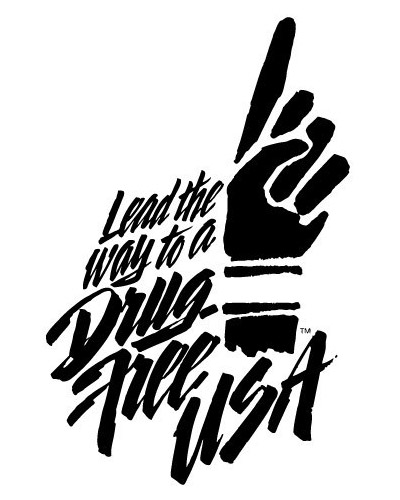
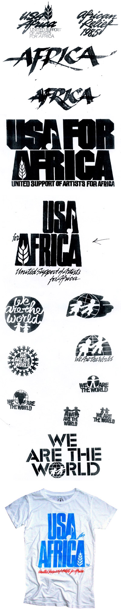
USA for Africa. Kragen was the horsepower behind it. He was also the man behind “Hands Across America”. He asked me to design the logo, gratis. All the suppliers were doing it gratis. No problem, I’d do anything for him. I went to the all-night recording of ‘We Are the World’ and as I walked into the studio there was the logo, huge, all over the place. Little did I know what was about to happen. As soon as the record was released it soared into a worldwide explosion.
For more on Michael, check out his website: michaelmanoogian.com
Be sure to check back next week for even MORE sketches from Michael!