

Wednesday, September 17, 2008
Graphic Arts Encyclopedia
Great resource from 1969. This book explains a lot of techniques and terminology from the graphic design and printing industry of the '60s, many of which have become obsolete. Also unfortunate that the cover art totally outshines each and every one of the 400+ accompanying visuals throughout the book, but what can you do...

Monday, September 15, 2008
Woodn't Count 15
Cool math puzzle lying around the Burlesque office. I believe Wezz picked this one up at an antique store in rural Minnesota. The object of the game is to arrange the numbered tiles so that each row - horizontal, vertical, and diagonal - totals 15. I gave it a quick try and couldn't figure it out. Math nerds STEP UP.
The type and package design here are top ranking. What typeface is this? Type nerds STEP UP.


Click for larger view of instructions
The type and package design here are top ranking. What typeface is this? Type nerds STEP UP.

Click for larger view of instructions
Friday, September 12, 2008
Philately Fridays: New Zealand 82, Brasil 80

Here's a selection of three stamps from a really fresh series from New Zealand in 1982. Love that illustration style so much.


And since I slipped up and didn't get a chance to do a posting yesterday, here's some bonus beats... a commemoration of the 100 year anniversary of the birth of Helen Keller. She's pictured here with her teacher Anne Sullivan. This is one of many stamps issued in June 1980 by different countries for the anniversary.

Wednesday, September 10, 2008
Animal logos
A few weeks ago, Adam Garcia shared some of his favorite typographic logos from the Signs + Emblems book. I've been flipping through my copy of this truly remarkable book and found a great selection of animal-based logos worth sharing.

Larralde & Llosa (Argentinian design studio)

Jésus Emilio Franco (Venezuelan design studio)

Jésus Emilio Franco (Venezuelan design studio)

L to R:
Showa Denko by Yusaku Kamemura (Japan)
Krefina Bank by Robert Geisser (Switzerland)
Confectioners by Charles Dean (USA)

Ramsey County (St. Paul, MN) Humane Society, designed by Richard Stanley
Larralde & Llosa (Argentinian design studio)
Jésus Emilio Franco (Venezuelan design studio)
Jésus Emilio Franco (Venezuelan design studio)
L to R:
Showa Denko by Yusaku Kamemura (Japan)
Krefina Bank by Robert Geisser (Switzerland)
Confectioners by Charles Dean (USA)
Ramsey County (St. Paul, MN) Humane Society, designed by Richard Stanley
Tuesday, September 9, 2008
Intellivision packaging
Everyone who knows me knows I'm all about classic video games. My dad got my brother and I hooked on Atari right when the 2600 was released and the rest is history. We never had Colecovision or Intellivision, so we missed out on a lot of games as well as their great packaging and accompanying artwork. As it went for just about every classic video game system, the lack of compelling graphics in the games necessitated compelling graphics on the packaging.
Here are a few Intellivision game boxes I came up on in a used game store recently. Really nice watercolor illustrations and classic late '70s / early '80s layout / collage style.


Here are a few Intellivision game boxes I came up on in a used game store recently. Really nice watercolor illustrations and classic late '70s / early '80s layout / collage style.
Monday, September 8, 2008
It's Never the Same Game Twice
Found this in an antique shop in Seattle. Didn't buy it, kinda regretted it, but now I'm seeing a bunch of them on eBay, so I take my regret back. Either way, this box design is off the charts. The board itself is crazy but I didn't have a chance to snap a photo cause the lady at the shop was giving my friend crap for trying to take photos of other stuff and I didn't want to miss my chance to get this one photo. Anyways...

Click for larger view

Click for larger view
Friday, September 5, 2008
Philately Fridays: Great Britain, 1971
Check out this great set of stamps from the UK, showing off four of their lovely university buildings. Really fresh architectural structures in their own right, especially the University of Essex's skyway, but even nicer as two color illustrations with big bold fields of solid color behind them... plus I'm just a sucker for well-used Helvetica.

Click for larger view
Wednesday, September 3, 2008
OPP: Aaron Draplin

If you're not familiar with the graphic design work and online presence of Aaron James Draplin, you're really doing yourself a disservice. Raised in Minnesota and now living in the lovely town of Portland, Oregon, Mr. Draplin has established himself as a true design powerhouse and an immeasurable source of '60s design knowledge.
Must-see TV:
Now that you've familiarized yourself with the way he rolls, I'll pass things off to Aaron to let him show off some of the great gems he found while traversing the World's Longest Yard Sale earlier this summer. Take it away Aaron!

I grabbed these beauties on my "World's Longest Yard Sale" adventure a month back. Somewhere in Tennessee, if I remember correctly. The flea market we were at was a bit of a dud. Wasn't seeing much. All the way back in the corner of the dusty field, under a little tarp tent, I came up on an old codger with a little First Day of Issue envelope display. There must've been a couple thousand of the things neatly filed in wood boxes. I started flipping through, pulling out ones that caught my eye. I couldn't contain my excitement, just flat out "losing my shit" as I pulled out each beautifully-embossed gem. Interestingly enough, the price seemed to go up with each one I pulled out. They were a buck each when I started, and by the time I picked 10 of the things, the price was around four bucks a pop. Funny how that shit works. Usually, I'd go to war over that kind of pricing, but not this time. I just paid up and shook the guy's hand, happy as hell. I just wasn't gonna leave 'em behind.
Click each image for detail view
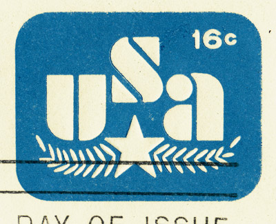
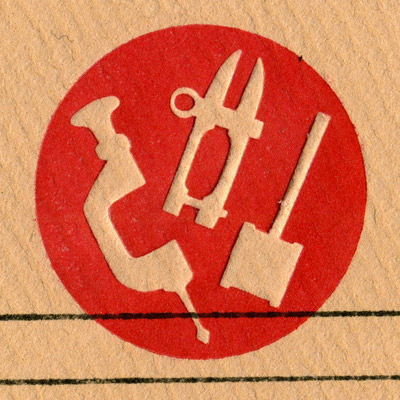
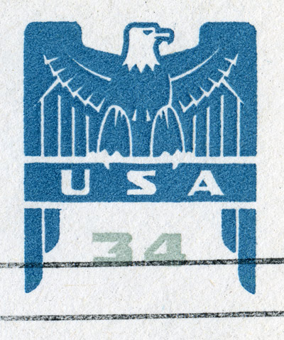
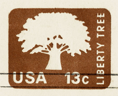
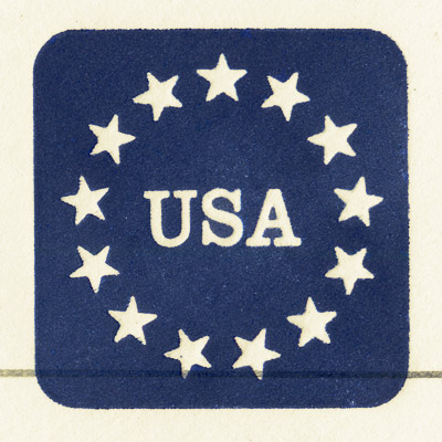
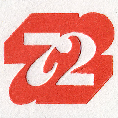
To see more of Aaron & friends' beautiful finds from the yard sale, click here here here and here.
To see more of Aaron's work and to keep up with his tremendously entertaining blog, visit: draplin.com
Emerald City
Just got back from a Labor Day weekend trip to Seattle. Burlesque crew was getting rid of posters and shirts at Bumbershoot. Pictured below are Ben and Jodi at our merch booth.

Click for larger view
After we had sold as much as we could sell, we kicked around Seattle for a bit, ate a zillion grilled salmon sandwiches and checked out a few record stores, antique stores, and the Pike Place Market. At the market, I found a little souvenir shop that was selling reproductions of this great poster for $5 each! I can't find any information on the artist other than his last name - Sandoval. The poster, entitled "Seattle Rain Barrel" is from 1979 and it's a winner.

Click for larger view

Click for larger view
After we had sold as much as we could sell, we kicked around Seattle for a bit, ate a zillion grilled salmon sandwiches and checked out a few record stores, antique stores, and the Pike Place Market. At the market, I found a little souvenir shop that was selling reproductions of this great poster for $5 each! I can't find any information on the artist other than his last name - Sandoval. The poster, entitled "Seattle Rain Barrel" is from 1979 and it's a winner.

Click for larger view
Tuesday, September 2, 2008
While I'm away...
I'm in and out of town, just missing all the Republican National Convention mayhem back home by a hair... although I can't say I'm missing it per sé. Since I'll be on the road, my posts for the rest of this week will be limited, so here's a) something which doesn't require me to dig through a bunch of books and b) something patriotic.
Enjoy!
Enjoy!
Subscribe to:
Posts (Atom)

