Thursday, March 4, 2010

LOGO WARS VII


This time we're putting the Canada Broadcasting Corporation sunburst up against the Nuclear Pacific Inc of Seattle radioactive burst!


CBC


Nuclear Pacific

FIGHT!

Tuesday, March 2, 2010

Letraset Type Samples

Extra tough typography from German designer Christof Gassner for a Letraset type sample catalogue, circa 1980.


Wednesday, February 24, 2010

Organ Lecture Recital poster


This poster was designed by Dietmar R. Winkler for MIT's combination lecture series and organ recitals circa 1966. Heavy geometry in effect.

Friday, February 19, 2010

Philately Fridays: Venezuela 1975


This stamp commemorates the 200th anniversary of Universidad Central de Venezuela. Still not 100% sure what the geometric design is supposed to represent. Any ideas?

Tuesday, February 9, 2010

Philately Fridays: Uruguay, 1971-74


Here are four stamps from Uruguay, one from each year between 1971 and 1974. Enjoy!


Related: Philately Friday: Uruguay, 1977

Wednesday, February 3, 2010

Eagles of Health Metal

Love this logo for the US Department of Health, designed by Edmond Sullivan.

Thursday, January 28, 2010

OPP: Jeremy Pettis gives us Tony Di Spigna!


Longtime Pileup reader Jeremy Pettis sent in these great examples of work from world class typographer Tony Di Spigna. Coming up in the 1970s working with Tom Carnase and Herb Lubalin, Di Spigna eventually started his own studio, Tony Di Spigna, Inc.

Here's a great pull-quote from the article...

"[Di Spigna] is amused by some clients who try to employ him on a sort of 'piecework' basis. If they have paid a certain price for, say, a four-word headline and they alter commission him to produce a two-word logo they will sometimes say 'But Tony, shouldn't it be half the price? After all, it's only two words.'

'These people miss the point,' says Di Spigna 'it's not the amount of words I'm charging for, it's the complete image.'"


Don't miss: Tony's zipper alphabet

Wednesday, January 27, 2010

The Shit is...


My man Blaine Rucker brought the ruckus right to my inbox with this one. No info on this one, so just sit back and enjoy it for what it is. Then go check out Blaine's collection of amusing and bizarro images at The Oro24K Tumblr.


Click image for larger view

Monday, January 25, 2010

Laissez Les Bon Temps Rouler

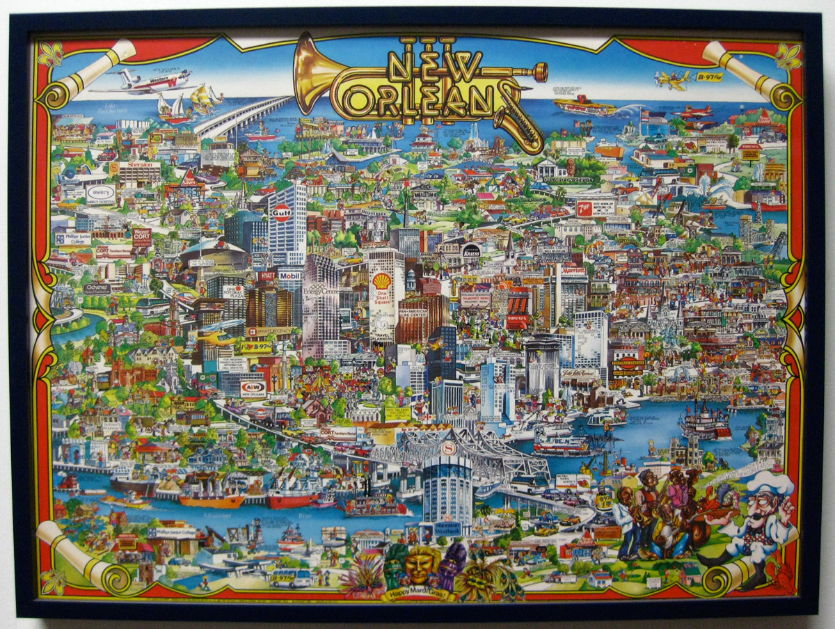
Everyone in Minneapolis right now is bummed the Vikings lost to the Saints last night and is probably bummed about New Orleans in general, so I want to share this poster to celebrate one of my favorite cities in the world. My dad grew up in the Crescent City, so I got to spend a lot of time there as a child, even living there for a year when I was 4 years old. It's impossible to visit New Orleans and not get mesmerized by the music, food, and people. I found this poster at my grandparents' house about two years ago. Fortunately their house was unharmed by the hurricane and I was able to pull all sorts of old magazines and books from there, several of which I've already shared on the blog.

This poster, illustrated by the ungoogleable artist Gayle Grout in 1983, really captures alot of what I love about New Orleans. Have a look around...


Click image to enlarge