
One of my all-time favorites, the fantastic Herb Lubalin, talking about working with PBS to develop their logo, all with a great animation of the different logos transforming from one to the next. Love it.
Showing posts with label Herb Lubalin. Show all posts
Showing posts with label Herb Lubalin. Show all posts
Tuesday, December 27, 2011

Thursday, January 28, 2010
OPP: Jeremy Pettis gives us Tony Di Spigna!


Longtime Pileup reader Jeremy Pettis sent in these great examples of work from world class typographer Tony Di Spigna. Coming up in the 1970s working with Tom Carnase and Herb Lubalin, Di Spigna eventually started his own studio, Tony Di Spigna, Inc.
Here's a great pull-quote from the article...
"[Di Spigna] is amused by some clients who try to employ him on a sort of 'piecework' basis. If they have paid a certain price for, say, a four-word headline and they alter commission him to produce a two-word logo they will sometimes say 'But Tony, shouldn't it be half the price? After all, it's only two words.'
'These people miss the point,' says Di Spigna 'it's not the amount of words I'm charging for, it's the complete image.'"


Don't miss: Tony's zipper alphabet
Monday, June 29, 2009
EXCLUSIVE: Herb Lubalin Archives at Cooper Union
Hopefully everyone who reads this blog saw fellow designer Justin Kay's thorough documentation of the incredible Herb Lubalin Archives at Cooper Union in NYC. If you haven't, I can't recommend it enough. Justin spent several hours sifting through posters, books, and even original sketches from the man who I consider to be the greatest contemporary graphic designer and typographer.
He was kind enough to save a few photographs for this exclusive post on So Much Pileup, so make sure to visit his site and leave a comment here thanking him!

Click for larger view

Click for larger view

Click for larger view

Click for larger view

Click for larger view

Click for larger view

Click for larger view

He was kind enough to save a few photographs for this exclusive post on So Much Pileup, so make sure to visit his site and leave a comment here thanking him!
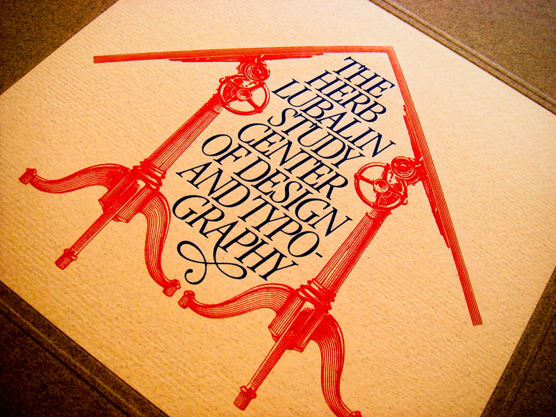
Click for larger view
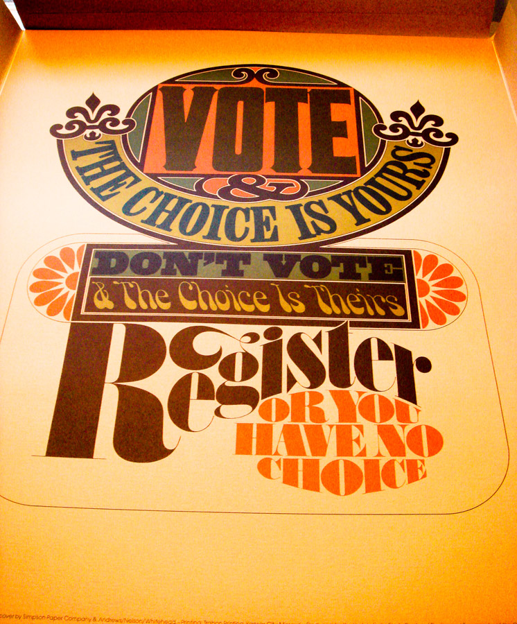
Click for larger view
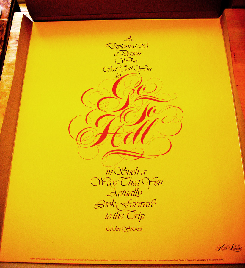
Click for larger view

Click for larger view
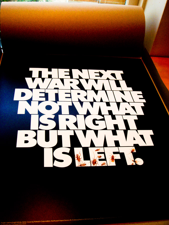
Click for larger view
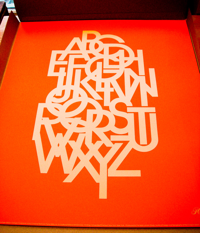
Click for larger view
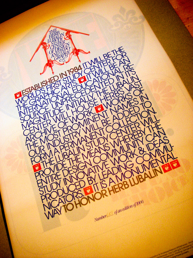
Click for larger view
Monday, April 20, 2009
Judging Books by their Covers, Madison edition
I spent the weekend in Madison, Wisconsin and had time to check out a few used book stores. I came across a few gems, but here are some photos of some of the books I didn't take home with me.

Lovely illustration with non-flamboyant Avant Garde typeface.

A typeface thesaurus with Serif Gothic (also designed by Avant Garde desiger Herb Lubalin) type for the title.

I thought this book was gonna be about coin collecting but it was actually a sleight-of-hand instructional manual. Hilarious. I can't remember the name of the font in the title but I think I have the Letraset sheet at home.

Whoever layed out this type HANDLED IT. So so fresh. This was also the first time I'd ever seen the word "equipotential."
Lovely illustration with non-flamboyant Avant Garde typeface.
A typeface thesaurus with Serif Gothic (also designed by Avant Garde desiger Herb Lubalin) type for the title.
I thought this book was gonna be about coin collecting but it was actually a sleight-of-hand instructional manual. Hilarious. I can't remember the name of the font in the title but I think I have the Letraset sheet at home.
Whoever layed out this type HANDLED IT. So so fresh. This was also the first time I'd ever seen the word "equipotential."
Thursday, April 16, 2009
Lubalin for Young Audiences
Herb Lubalin & crew get it in for young music and theater lovers in N.Y.

Thursday, January 29, 2009
Beards by Tom Carnase
It's hard for me to make a claim like this, but this book cover for a pressing of Reginald Reynolds' 1949 book "Beards," might be my favorite type treatment ever. It's gorgeously drawn by Herb Lubalin's colleage Tom Carnase, it's funny, it's concise, it's perfect.

Tuesday, January 13, 2009
Fanny Hill
Here's an illustrated version of the 18th century erotic book Fanny Hill with psychedelic illustrations by Zevi Blum and gorgeous typography by the one and only Herb Lubalin.
From the back of the book, "Fanny Hill, an orphaned, fortuneless naif, makes her way from country to city, is exposed to the wicked ways of the town, is set upon by various exploiters of both sexes, but finally triumphs due to her generous heart and unsullied innocence. Like Tom Jones, Fanny may be ravished again and again in body but the innocence of her soul is ever untarnished..."


From the back of the book, "Fanny Hill, an orphaned, fortuneless naif, makes her way from country to city, is exposed to the wicked ways of the town, is set upon by various exploiters of both sexes, but finally triumphs due to her generous heart and unsullied innocence. Like Tom Jones, Fanny may be ravished again and again in body but the innocence of her soul is ever untarnished..."
Wednesday, October 22, 2008


Monday, September 22, 2008
Pocket Coffee
I'm not a coffee drinker, but I'd probably eat this. Maybe it's the chocolate aspect, maybe it's the gorgeous lettering designed by Herb Lubalin, who you can bet your bottom dollar you'll be reading a lot about here in the weeks and months to come, but either way this is really dope.

Subscribe to:
Posts (Atom)

