Wednesday, October 14, 2009

David Weidman

Pileup reader John Ballon recently reminded me of illustrator David Weidman. Weidman worked as an animation artist with Hannah-Barbara before opening up a framing store in Los Angeles. There, he attempted to sell some of his gorgeous screenprinted posters but it seemed most of his customers were more interested in his frames! Years later, his artwork has been compiled into a book entitled The Whimsical Work of David Weidman. One look at his art and you can see how it still resonates with today's artists and illustrators.


Check out this monstrous collection of Weidman's art on Flickr.

To see more and order original screenprints from David Weidman, visit weidmansart.com

Monday, October 12, 2009

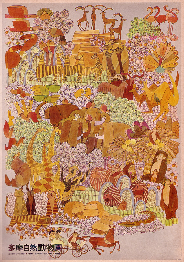
Tama National Zoo

Poster designed for Tokyo's Tama National Zoo by Yasuo Shigehara. Circa 1967ish.


Click for larger view

Wednesday, October 7, 2009

Pinball Fever: 4 Square


Here's a great looking pinball machine from the always hot Gottlieb. It's 1971's "4 Square." Game design by Ed Krynski. Artwork by Gordon Morison, who was responsible for creating the art of nearly 150 different pinball games for Gottlieb. After putting in his time for Gottlieb, Morison was still working up to 80 hours a week doing freelance art and advertising projects up until his death in 2000.


Friday, October 2, 2009

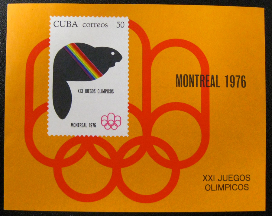
Philately Fridays: Cuba, 1976


How to win me over through graphic design in three easy steps:
1) Start with a HUGE wash of bright orange (Cuba, I can always count on you for this)
2) Use one of my favorite logos of all time (1976 Montreal Olympic games)
3) Add a minimal graphic illustration of an animal (a beaver will do just fine)


Click for larger view

Thursday, October 1, 2009

LOGO WARS VI


UNPRECEDENTED! It's fight night at So Much Pileup and we are thrilled to present our first ever Logo Wars handicap match! Our featured fighter is the logo for the nation's first and largest jai-alai center, Miami Jai-Alai. The clever use of the "J"s and the dot of the "i" combined with slick Avant Garde type make this one a tough contender.


Miami Jai-alai's opponents are the tag team of:
1) KALGLO: an electronics logo, using the same style of bold Avant Garde type and an illustrative electric burst inside the "O."


2) FORRESTER FLOWERS: Look out Jai-Alai, these "F"s can fit into a typographic illustration just as well as your "J"s can.


FIGHT!

Friday, September 25, 2009

Philately Fridays: Australia 1971


I don't have many bad things to say about metallic ink, nor about heavily-outlined geometry. Check out this exuberant rendition of the Sydney Stock Exchange.

Thursday, September 24, 2009

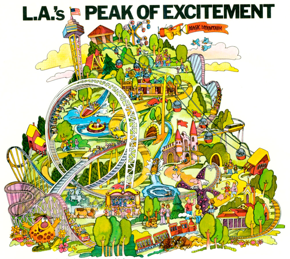
Magic Mountain

Gorgeous, anonymous watercolor illustration for Six Flags Magic Mountain. Amusement park maps 4 life.


Click for larger view

Related:
Vacationland magazine cover
Magic Kingdom brochure

Monday, September 21, 2009

Three logos

Three typographic logos for you.


Designed by Kenneth Hollick under the art direction of Geoffrey Tucker Ltd.


Designed by Marlene Blomerus for Jeremy Sampson Associates for a South African commerical carpeting company.


Designed by Bob Coonts for the Lincoln Community Center

Friday, September 18, 2009

Philately Fridays: Venezuela


I don't know why it took me so long to find out about Venezuelan stamps. Now that they're officially on my radar, you'll be seeing a lot more of them.


Thursday, September 17, 2009

Chocolate Sardines

Packaging design for Captain Kohler's chocolate sardines. This seems way more interesting to me than chocolate bunnies, especially with the whole elaborate sardine un-packaging process. Either way, the nautical-themed illustrations with the big clunky shapes are really doing it for me here.


Art directed by Sopad in France.
Illustration by Roger Harris.

Wednesday, September 16, 2009

Anthony Forster

Came across some outstanding typographic work from UK-based artist Anthony Forster, who is now creating watercolor dog and horse paintings.* But let's focus on his '70s type work!

* On October 3, 2011 I received an email from Anthony's son Dan Forster telling me I had mixed up my Anthony Forsters! The watercolor artist I had mentioned earlier is NOT the same artist who created all of the lettering in my post here. Keep an eye on Dan's blog for updates with more design work from his dad in the near future. Thanks Dan!