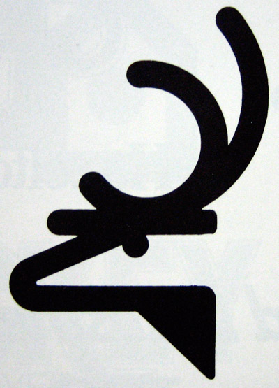
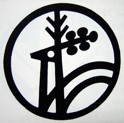
Both are quite odd really. I like the eye of the animal in the second logo though. my vote is for the second, however it's guitar-head antlers are weird.
Ilike the timeless simplicity of the first elk. Yet I like the funky weird antlers of the second. Also the fact that it is in a circle would make it way easier to use as a logo. However there is still something about the first that I just like more. So serious and slick.
I like the elk logo better. It's a more fluid and unified form. And the antlers on #2 are from two different types or ages or somethings of reindeer - it should stick with one antler style, the pointy ones or the blunt ones.
I do really like both of these contenders, but if I had to choose, it would be the elk - very clean and bold. Plus you just know there were a thousand versions of it before it got to looking so effortlessly simple.
To accurately critique the two, I think it would be helpful to include a bit more negative space around them, so as to bring more focus to the graphic.
That being said, I have to go with #1, though I think with a few adjustments it could be made more effective.
It starts with a single line width at the top and then throws that triangular shape in at the last minute. And it uses a rounded end to every stroke except for the one at the back of the head. Had it been more consistent, I think it would have been a bit more more effective.
Also, I think the head should face to the right, as right facing elements signify progress.
Like this: http://img385.imageshack.us/img385/1826/elkxq5.png


18 comments:
Both are quite odd really. I like the eye of the animal in the second logo though. my vote is for the second, however it's guitar-head antlers are weird.
#1.
Ilike the timeless simplicity of the first elk. Yet I like the funky weird antlers of the second. Also the fact that it is in a circle would make it way easier to use as a logo. However there is still something about the first that I just like more. So serious and slick.
The second logo appears here and is credited as Jelen, Beograd, Jugoslavia:
http://www.flickr.com/photos/mr_carl/2342864506/sizes/l/in/set-72157604144345854/
Could have been an old city logo for Belgrade? No idea.
I think I prefer it over the fist though, just like how its contained in the out circle. ;)
Yeah, I'm gonna vote for 2 as well. It's pretty close though. I like how 1 has some kinda tough attitude. But 2 is just a bit more weird.
Reindeer me thinks - something about it reminded me of the old Hoover logo?? http://tinyurl.com/5zp4bs
I like the elk logo better. It's a more fluid and unified form. And the antlers on #2 are from two different types or ages or somethings of reindeer - it should stick with one antler style, the pointy ones or the blunt ones.
wow. both good. I really like #1. Simple shape/line but very descriptive.
wow. both good. I really like #1. Simple shape/line but very descriptive.
I'm going for one, for the simplicity and fluidity.
Number one. For composition.
#1.
The antlers on #2 blow it.
Number 1. The inside and outside radii of the snout are amazing compared the awkward indentation on number 2.
I do really like both of these contenders, but if I had to choose, it would be the elk - very clean and bold. Plus you just know there were a thousand versions of it before it got to looking so effortlessly simple.
#uno is the beez kneez. nice bold, simple, clean, straight to the point dopegnostical funk.
To accurately critique the two, I think it would be helpful to include a bit more negative space around them, so as to bring more focus to the graphic.
That being said, I have to go with #1, though I think with a few adjustments it could be made more effective.
It starts with a single line width at the top and then throws that triangular shape in at the last minute. And it uses a rounded end to every stroke except for the one at the back of the head. Had it been more consistent, I think it would have been a bit more more effective.
Also, I think the head should face to the right, as right facing elements signify progress.
Like this: http://img385.imageshack.us/img385/1826/elkxq5.png
Number 1 of course !
number 1. i appreciate its simplicity
as well its weight.
Post a Comment