
However, Montreal's own Georges Huel did create this fantastic logo for the '76 games.
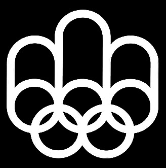
This is what a logo should be - it says so much with no excess at all. With just a few circles and "sausages shapes" (shout-out to Wezzburlesque for the phrase), you've got the eternally iconic Olympic rings, the three podiums for the gold, silver, and bronze medal winners, and an M for Montreal.


1 comment:
It's curious, especially given the '76 games were the ones following the disastrous '72 games, but this logo reminds me of the Photoshopped images, of a reconstructed WTC giving the finger to terrorists, that have circulated ever since 9/11. . .
Post a Comment