As a young buck who spent a lot of time watching television in the early 1980s, I was always fascinated with the HBO intro... you know... the camera flying over the city and the giant chrome letters rising up and then turning into a neon space station. I found a bunch of earlier renditions of HBO's station identification animations which are also worth checking out, so here they are:
1978, quick animation. very hot rainbow stripe logo:
Late 1980, total Great Space Coaster style:
Late 1981, art deco disco laser style:
The main attraction:
Can't forget the April Fool's edition:
and now, one of the freshest things I've ever seen on Youtube, a stunning behind-the-scenes look at the creation of the infamous 1983 HBO "city" intro. Hold onto your hats...
Today I'm passing the baton to my dude Bryan Haker. Bred in Minneapolis, Hake The Snake gets 'er done in Do Or Die Bed Stuy and is a hell of a resource of modern design knowledge and Jamaican patois. Take it away my friend...
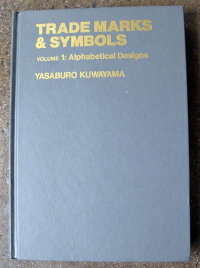
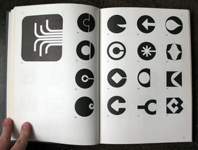
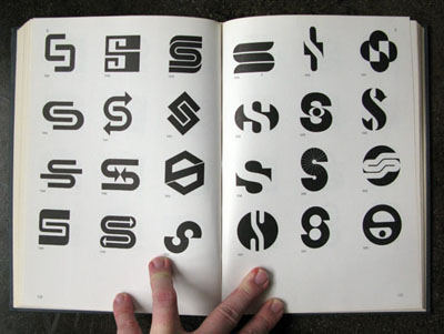
Yasaburo Kuwayama was born in Niigata prefecture, Japan in 1938. He graduated from the Musashino Art University in 1962 and taught Typography at Asagaya Acadademie de Beaux-Arts for 5 years from 1966. In 1969 he established the Kuwayama Design Room. In 1970 he began teaching typography at the Musashino Art University. In '75 he was teaching lettering at the Asahi Center and served as a permanent manager of the Japan Finish Work Association. In 1979 he retired from his posts and allowed him more time for other interests.
Says here that at present (I doubt it, the book is pretty old) he is a member of the Association du Typographique Internationale, the Japan Typography Association, the Federation of German Typographers, The Tokyo Designers Space and the Japan Graphic Designer Association
And to top it off he's a Jehovah Witness ( Not that there's anything wrong with that) I trust the Pileup is an equal opportunity organization.
His main books include Lettering & Design, Typeface Design, and Graphic Elements of the World.
POW!
Most of this was taken from one of his other books I have. More over, I came upon the guy from finding one of his books at a book drive in a hipstered-out park in Brooklyn. Even better yet, It was free!! Got over on that one.. I think I have 3-4 of his books now.. all holy grail steez.
This stamp was issued to commemorate the 25th anniversary of Cuba's Rebel Radio, a station started by Che Guevara (obviously pictured on the stamp) to provide music and news during the Cuban Revolution. Beautiful, simple, and brightly-colored design, very characteristic of many designs coming out of Cuba during this era.
Look how fresh and well-designed basketball cards used to be! A photo of the player, a huge field of a single color in the background, and the team name in giant, clunky, angled type.
Pictured here is George Thompson's 1971 card from his stint playing for the Memphis Tams before he went on the play for the Bucks and then conceive his son.
Here's another one from the same series. My man can barely fit in the frame!
Found this heatrock in a San Francisco thrift store a couple of years ago. The illustrations sprinkled throughout the book are OK - not nearly as robust and well-executed as the cover image. The artwork is by Ati Forberg, who illustrated a few other children's books throughout the 1960s.
Click for larger view
Fans of Diplo might recognize this cover as being from the same series as the volume ganked for the cover artwork for he and Tripledouble's incredible psych / funk mix CD "AEIOU 2."
I'm not a coffee drinker, but I'd probably eat this. Maybe it's the chocolate aspect, maybe it's the gorgeous lettering designed by Herb Lubalin, who you can bet your bottom dollar you'll be reading a lot about here in the weeks and months to come, but either way this is really dope.
Another hit from the freestyle fanatic... Aaron Draplin comes through with more straight heat. We take you now to Mr. Draplin, reporting live from Portland, OR:
My buddy Dale and I were junkin' high up on Mt. Tabor. Garage sales can be tough. There's only so much time in the day, so you gotta be picky. The trick is to do a slow "drive by" surveying the scene. This way if you see a table with baby clothes, you can floor it and get the fuck outta there.
Just beyond the tables of clothes and shit, you could see a little "media section." Enough of a reason to roll the dice. We parked and headed straight for the records, books and outdated software.
I was lucky enough to find an old book called "Aviation Fundamentals." The asking price was 50 cents. I took one look at the old sea hag sitting there—who eyeballed us from the time we set foot on her property—and offered her a quarter. She took the bait and we got the hell out of there. Just like that. That's is how we do it.
Super hot one from Israel, commemorating the 9th Maccabiah Games, a competitive sporting event similar to the Olympics held every four years for Israeli athletes. Excellent illustration work combining the Star of David with a runner and I love the typography in this one, specifically the way the Hebrew and English type flow so well together.
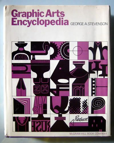
Great resource from 1969. This book explains a lot of techniques and terminology from the graphic design and printing industry of the '60s, many of which have become obsolete. Also unfortunate that the cover art totally outshines each and every one of the 400+ accompanying visuals throughout the book, but what can you do...
Cool math puzzle lying around the Burlesque office. I believe Wezz picked this one up at an antique store in rural Minnesota. The object of the game is to arrange the numbered tiles so that each row - horizontal, vertical, and diagonal - totals 15. I gave it a quick try and couldn't figure it out. Math nerds STEP UP.
The type and package design here are top ranking. What typeface is this? Type nerds STEP UP.
Here's a selection of three stamps from a really fresh series from New Zealand in 1982. Love that illustration style so much.
And since I slipped up and didn't get a chance to do a posting yesterday, here's some bonus beats... a commemoration of the 100 year anniversary of the birth of Helen Keller. She's pictured here with her teacher Anne Sullivan. This is one of many stamps issued in June 1980 by different countries for the anniversary.
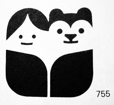
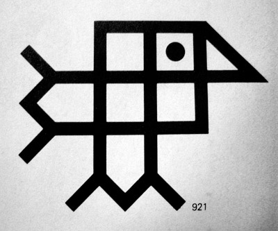
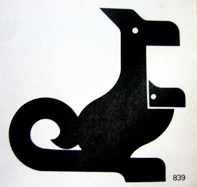
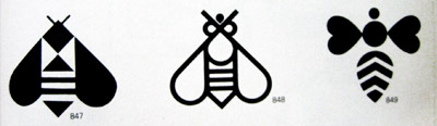
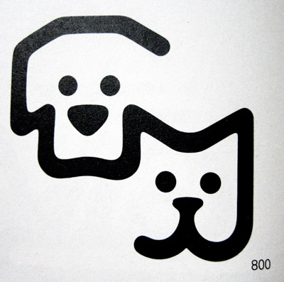
A few weeks ago, Adam Garcia shared some of his favorite typographic logos from the Signs + Emblems book. I've been flipping through my copy of this truly remarkable book and found a great selection of animal-based logos worth sharing.
Larralde & Llosa (Argentinian design studio)
Jésus Emilio Franco (Venezuelan design studio)
Jésus Emilio Franco (Venezuelan design studio)
L to R: Showa Denko by Yusaku Kamemura (Japan) Krefina Bank by Robert Geisser (Switzerland) Confectioners by Charles Dean (USA)
Ramsey County (St. Paul, MN) Humane Society, designed by Richard Stanley
Everyone who knows me knows I'm all about classic video games. My dad got my brother and I hooked on Atari right when the 2600 was released and the rest is history. We never had Colecovision or Intellivision, so we missed out on a lot of games as well as their great packaging and accompanying artwork. As it went for just about every classic video game system, the lack of compelling graphics in the games necessitated compelling graphics on the packaging.
Here are a few Intellivision game boxes I came up on in a used game store recently. Really nice watercolor illustrations and classic late '70s / early '80s layout / collage style.
Found this in an antique shop in Seattle. Didn't buy it, kinda regretted it, but now I'm seeing a bunch of them on eBay, so I take my regret back. Either way, this box design is off the charts. The board itself is crazy but I didn't have a chance to snap a photo cause the lady at the shop was giving my friend crap for trying to take photos of other stuff and I didn't want to miss my chance to get this one photo. Anyways...
Check out this great set of stamps from the UK, showing off four of their lovely university buildings. Really fresh architectural structures in their own right, especially the University of Essex's skyway, but even nicer as two color illustrations with big bold fields of solid color behind them... plus I'm just a sucker for well-used Helvetica.
If you're not familiar with the graphic design work and online presence of Aaron James Draplin, you're really doing yourself a disservice. Raised in Minnesota and now living in the lovely town of Portland, Oregon, Mr. Draplin has established himself as a true design powerhouse and an immeasurable source of '60s design knowledge.
Must-see TV:
Now that you've familiarized yourself with the way he rolls, I'll pass things off to Aaron to let him show off some of the great gems he found while traversing the World's Longest Yard Sale earlier this summer. Take it away Aaron!
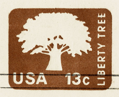
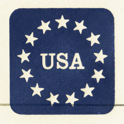
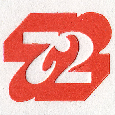
I grabbed these beauties on my "World's Longest Yard Sale" adventure a month back. Somewhere in Tennessee, if I remember correctly. The flea market we were at was a bit of a dud. Wasn't seeing much. All the way back in the corner of the dusty field, under a little tarp tent, I came up on an old codger with a little First Day of Issue envelope display. There must've been a couple thousand of the things neatly filed in wood boxes. I started flipping through, pulling out ones that caught my eye. I couldn't contain my excitement, just flat out "losing my shit" as I pulled out each beautifully-embossed gem. Interestingly enough, the price seemed to go up with each one I pulled out. They were a buck each when I started, and by the time I picked 10 of the things, the price was around four bucks a pop. Funny how that shit works. Usually, I'd go to war over that kind of pricing, but not this time. I just paid up and shook the guy's hand, happy as hell. I just wasn't gonna leave 'em behind.
Click each image for detail view
To see more of Aaron & friends' beautiful finds from the yard sale, click hereherehere and here.
To see more of Aaron's work and to keep up with his tremendously entertaining blog, visit: draplin.com