3-stamp series from 1970 showing off an array of butterflies. So special. My girlfriend found a Spanish tapestry that looks pretty similar to these and I'll try to post that next week.
Friday, July 31, 2009
Philately Fridays: New Zealand 70
3-stamp series from 1970 showing off an array of butterflies. So special. My girlfriend found a Spanish tapestry that looks pretty similar to these and I'll try to post that next week.
Friday, July 24, 2009
Philately Fridays: United Nations, 1977
Funky little two stamp series from the United Nations - I'm pretty sure from 1977 and I can't figure out from which country these are from. Either Austria or Switzerland. Anyone out there know? Either way, the wing-shaped hands are really doing it for me.
Wednesday, July 22, 2009
CHICKENHEADS
Designed by Dickens Design Group in 1972 for Con Agra's line of Puerto Rican-bred chickens.
I think I've seen some recent hip hop or funk record label completely rip this off for their own logo. Can't remember who though.
Friday, July 17, 2009
Philately Fridays: Germany, 1974
4-stamp series from Germany to promote the likkle youths makin' real world moves.
Photography? Check.
Running? Check.
Playing a tune on a fiddle? Check.
Amateur science? Check.
Thursday, July 16, 2009
The Technicolor Yellow Pages
A couple of years ago, I decided that Google had made phone books obsolete. They're clunky, quicky-outdated, and waste paper, and are the bane of an apartment lobby's existence. Well, phone book company, let me make a deal with you. If you can start making phone books look like this again, I'll take back everything I ever said about you.
Designed by the great Asher Kalderon with Ester Kurty in 1974.
Wednesday, July 15, 2009
OPP: Gregory Hubacek
I was sent a few photos by my buddy Gregory Hubacek, Minneapolis-based graphic designer and recent Layer Tennis finalist. He found this cool booklet from Minnegasco in a thrift store and snapped a couple of cell phone pics (please pardon the image quality). I'm guessing these are from 1970? Nice find Greg!
Friday, July 10, 2009
Tuesday, June 30, 2009
Horatio's
Slick logo for a restaurant called Horatio's. I'm guessing it was a seafood restaurant and now I'm hungry. Designed in 1973 by Murray Gaby of Barrett & Gaby, Inc.
Monday, June 29, 2009
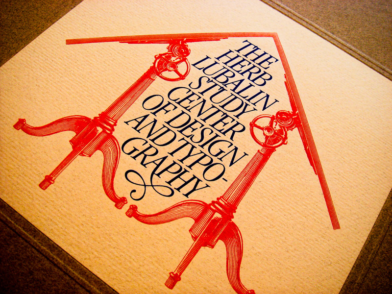
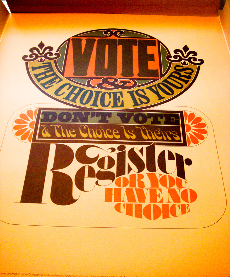
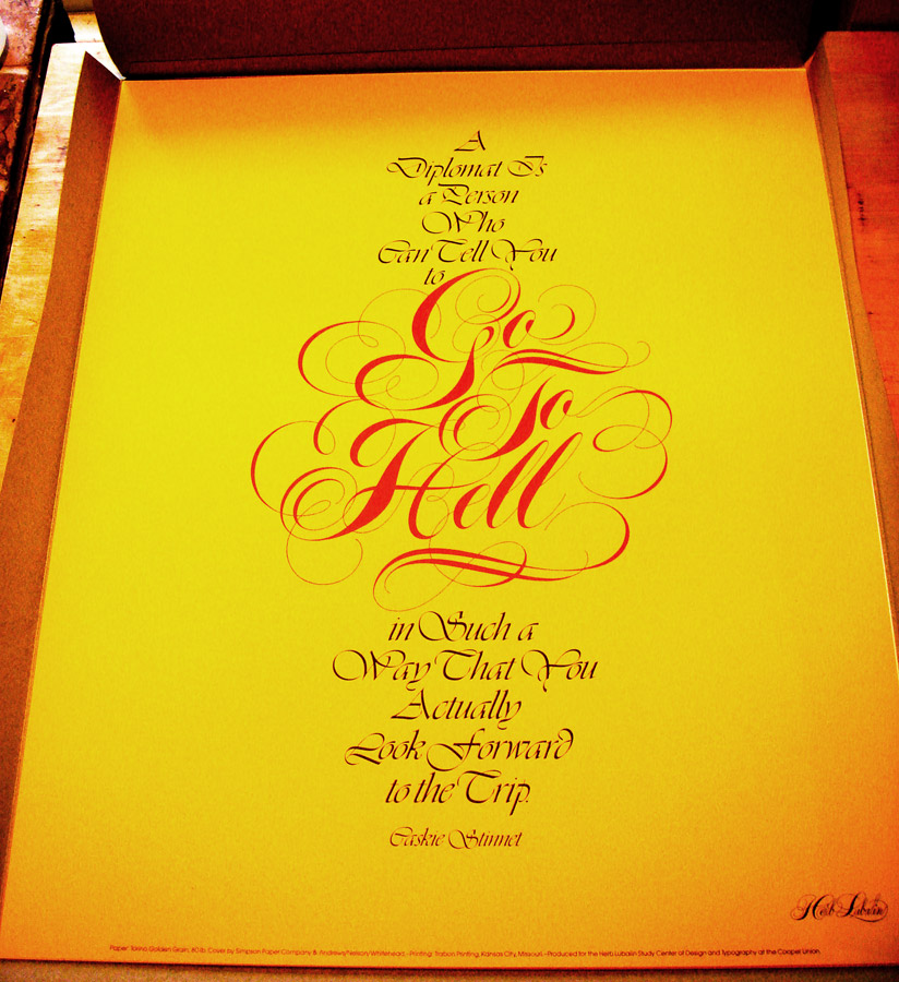
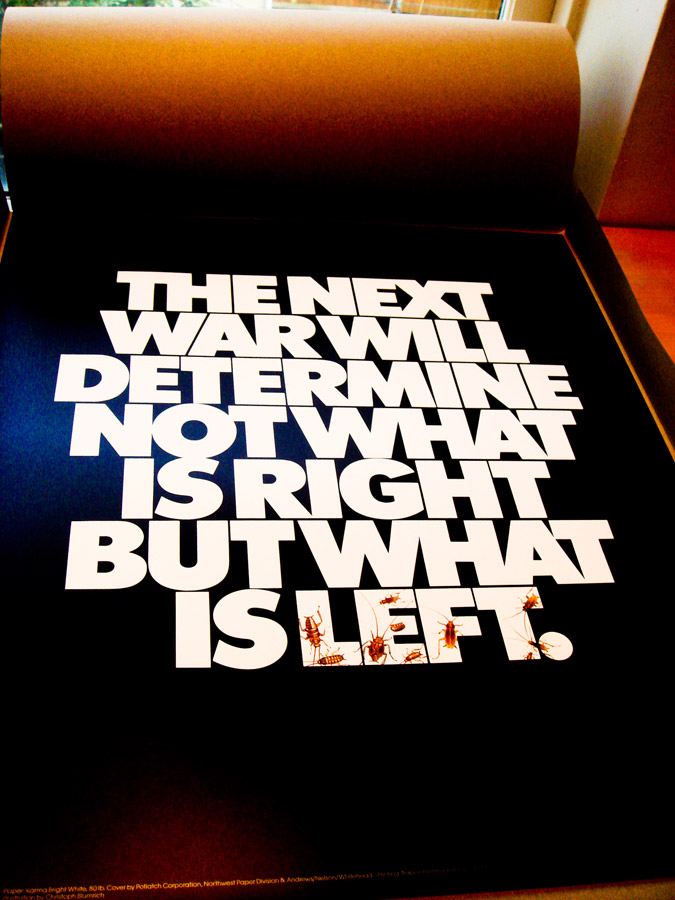
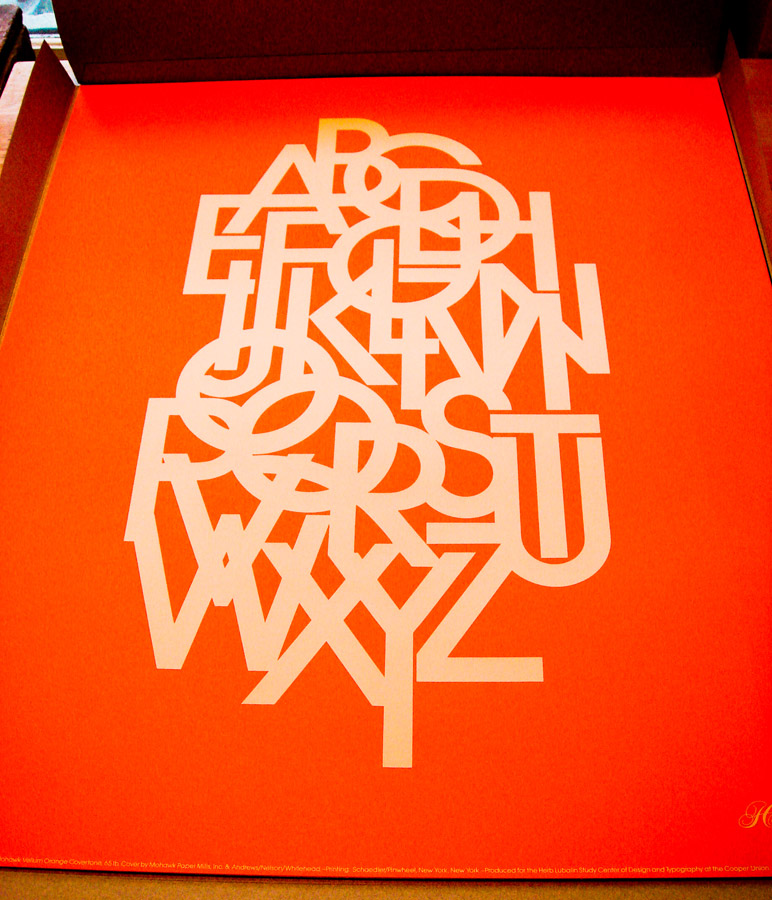
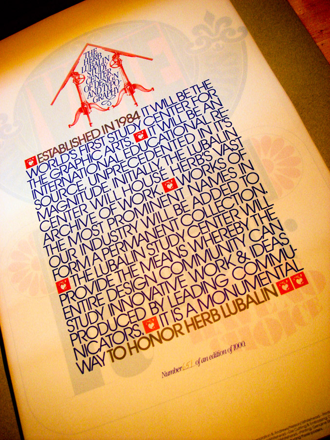
EXCLUSIVE: Herb Lubalin Archives at Cooper Union
Hopefully everyone who reads this blog saw fellow designer Justin Kay's thorough documentation of the incredible Herb Lubalin Archives at Cooper Union in NYC. If you haven't, I can't recommend it enough. Justin spent several hours sifting through posters, books, and even original sketches from the man who I consider to be the greatest contemporary graphic designer and typographer.
He was kind enough to save a few photographs for this exclusive post on So Much Pileup, so make sure to visit his site and leave a comment here thanking him!

Click for larger view

Click for larger view

Click for larger view

Click for larger view

Click for larger view

Click for larger view

Click for larger view
He was kind enough to save a few photographs for this exclusive post on So Much Pileup, so make sure to visit his site and leave a comment here thanking him!
Click for larger view
Friday, June 26, 2009
Philately Fridays: Bulgaria, 1980
This is one of my all-time favorite stamps and I've been sittin' on it, waiting for the right time to share it.
Can you feel it?
Subscribe to:
Posts (Atom)