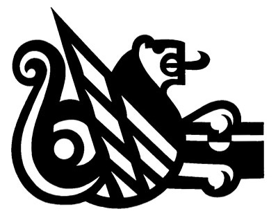
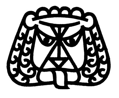
Although I really like Robert Gessner's execution of the lion(symmetry is always great), Honegger-Lavater's logo is a little more timeless in my opinion. Both are a too elaborate. so is Honegger-Lavater's logo supposed to be some winged flying serpant griffin holding a treasure chest? because that's sick! That being said, i pick Honegger-Lavater's logo.
It's hard to compare the two since they are for very different uses.
displaying a lion as in the top logo is very common for banks. To represent the desired qualities the lion should be facing to the left, but even RBC has thrown that away: http://www.rbc.com/history/leo/index.html
Hhhmm, tough one - I not particularly keen on either, but if I had to pick my favourite it would have to be the top one just for the beautiful swirly tail.
palliGonna have to agree with Delicious on this one. Both have pros and cons. Overall though gonna have to go with the top one though i'd like to tweak it some. 143. www.ignoredprayers.com
I have a soft spot in my heart for the second lion. His hair kicks ass and he's sticking his tongue out. He gets my vote.
And I'm really all about including the below word-verification in each of my comments, because they're always really inspiring in a totally abstract, stream-of-consciousness way. For example, today's is:
Both designs have great line work but I have to go with Gessners. Reasoning, I can make out what is a bit clearer and it def makes me fear the leo zodiacs out there.
The top one is an absolute mess. The mix of thin and thick lines make it look chaotic, and the pointy triangle wing thing looks more like a renegade point in the vector path. As a software architect who works in graphics, it looks exactly like what might happen if a path algorithm did wrong math or introduced garbage into the list of points in a vector path. That huge pointy triangle has no business being there among the curves.
At least the bottom one looks like a lion - vaguely like the Cowardly Lion.
I'm gonna respectfully disagree with you, Armpit. While the top logo does have some odd usage of positive/negative space, I think that it would have probably been viewed as interesting and unique in its day, regardless of what our new-fangled vector programs might have conditioned us to think. The Honegger-Lavater version at least shows some instances of creativity where as the Gessner version presents nothing that couldn't be found in a Zodiac clip art book at your local library. Plus it looks mean.


11 comments:
Although I really like Robert Gessner's execution of the lion(symmetry is always great), Honegger-Lavater's logo is a little more timeless in my opinion. Both are a too elaborate. so is Honegger-Lavater's logo supposed to be some winged flying serpant griffin holding a treasure chest? because that's sick! That being said, i pick Honegger-Lavater's logo.
No contest, first round KO for the lion on the top.
Can I vote for Ref Mario?
It's hard to compare the two since they are for very different uses.
displaying a lion as in the top logo is very common for banks. To represent the desired qualities the lion should be facing to the left, but even RBC has thrown that away:
http://www.rbc.com/history/leo/index.html
anyway, those things aside, i prefer the first.
Hhhmm, tough one - I not particularly keen on either, but if I had to pick my favourite it would have to be the top one just for the beautiful swirly tail.
Oh yeah, that totally is a griffin. Well still... So nobody's feelin' lion #2's ill curls and mean mug swag?
palliGonna have to agree with Delicious on this one. Both have pros and cons. Overall though gonna have to go with the top one though i'd like to tweak it some. 143. www.ignoredprayers.com
I have a soft spot in my heart for the second lion. His hair kicks ass and he's sticking his tongue out. He gets my vote.
And I'm really all about including the below word-verification in each of my comments, because they're always really inspiring in a totally abstract, stream-of-consciousness way. For example, today's is:
califest.
Both designs have great line work but I have to go with Gessners. Reasoning, I can make out what is a bit clearer and it def makes me fear the leo zodiacs out there.
The top one is an absolute mess. The mix of thin and thick lines make it look chaotic, and the pointy triangle wing thing looks more like a renegade point in the vector path. As a software architect who works in graphics, it looks exactly like what might happen if a path algorithm did wrong math or introduced garbage into the list of points in a vector path. That huge pointy triangle has no business being there among the curves.
At least the bottom one looks like a lion - vaguely like the Cowardly Lion.
I'm gonna respectfully disagree with you, Armpit. While the top logo does have some odd usage of positive/negative space, I think that it would have probably been viewed as interesting and unique in its day, regardless of what our new-fangled vector programs might have conditioned us to think. The Honegger-Lavater version at least shows some instances of creativity where as the Gessner version presents nothing that couldn't be found in a Zodiac clip art book at your local library. Plus it looks mean.
Post a Comment