
Any designer's studio or home is filled with books, stickers, posters, postcards, and other pieces of history. I started this blog to share some of the work from my collection that's inspired me as a designer, primarily from the late 1960s through the early 1980s. I'll be posting logos, postage stamps, motion graphics, packaging and promotional design from the time I consider to be the golden era of graphic design, just before computers took over and anyone with a copy of Photoshop and 10 fonts started calling themselves designers.
I'll try to keep the posts focused, but for starters I'm just gonna show a mish-mosh of things to give you an idea of what's to come. Enjoy it and drop me a line if you like what you see.
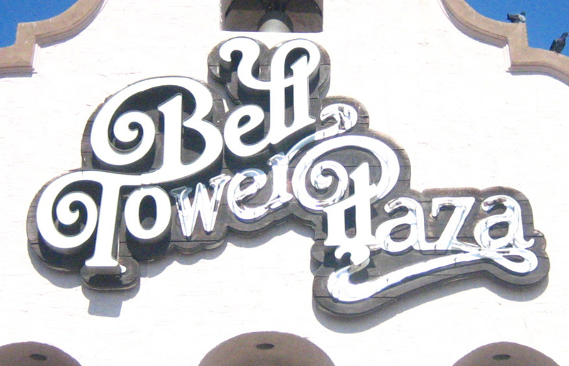
BELL TOWER PLAZA IN HEMET, CA
This is a big sign in front of a strip mall in Hemet, CA - about 1.5 hours southeast of Los Angeles. I don't know anything about the history of this giant sign or who designed the lettering, but it's hot to death and as soon as I saw it, I made my girlfriend do a u-turn so I could run out of the car and snap a photo.
(Click for larger view)
TV GLOBO
Here are some screenshots of TV graphics for Brazil's TV Globo, one of the largest networks in the world. These graphics are from 1977 or 1978. I can't find much about "O GRITO," but I'm guessing it's some kind of singing show. "LOCO MOTIVAS" was a soap opera about some desperate Brazilian housewives, who, like E-Swift said, must have had loco motives, I mean crazy reasons to wanna step up.
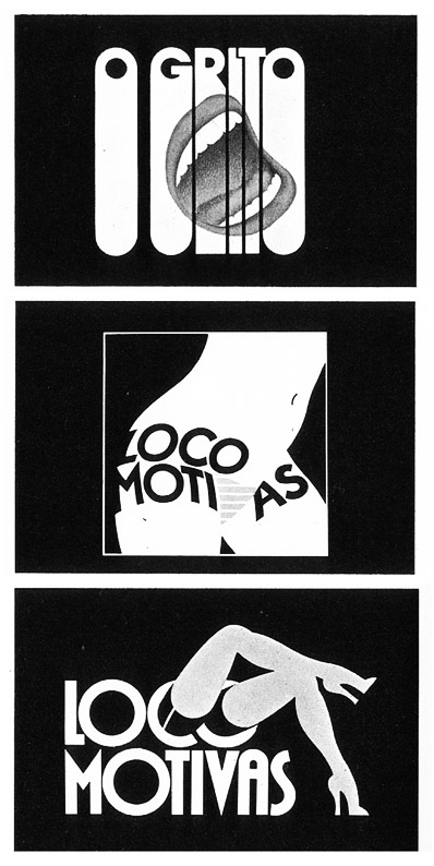
MUST SEE TV: The intro to Loco Motivas!!!
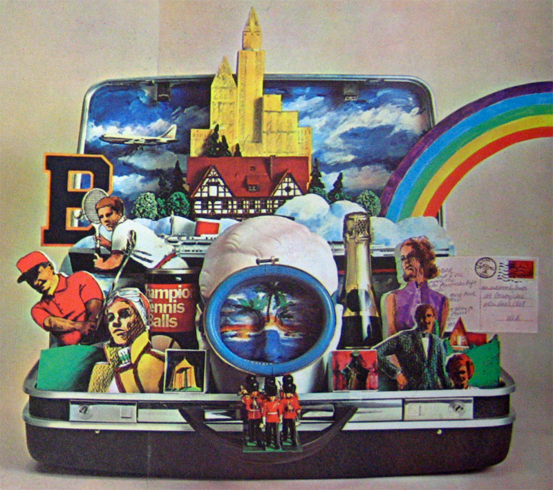
BURLINGTON INDUSTRIES ANNUAL REPORT
Incredible still-life collage created for a fabric company's 1969 annual report. Designed by the NYC-based firm Chermayeff & Geismar, who have designed memorable identities for gigantor clients such as NBC, Mobil, Xerox, and Barneys in their 50+ years in the industry. Check out their website to see the U.S. Pavilion they designed for the 1970 World Expo in Osaka.
(Click for larger view)


10 comments:
nice blog! looking forward to see more posts!!!!
congrats mike! I might be able to get you some info on those brasil joints, i will ask.
looks great!
Great looking blog, love the TV Globo graphics - can't wait to see some more!
its awesome to see how people see things we don´t. I´m also a graphic "geek" from Brasil, here we are well manipulated by Tv GLOBO, and her sub culture tv shows, i had the oportunity to watch a Hans Donner audience about 3 years ago, and the guy is fucking crazy i mean FUCKING crazy! its sad how this is some how our graphic culture because if you see tv globo graphics now days they still stuck in the 80´s. im not saying that i dont like these kind of stuff, i really do, and im really glad to see this kind of stuff in the internet! but if you take a closer look to tv globo you will see they are not so graphics at all.You should check the first Tv Globo logo, by hans donner.
sorry about my shit english.
i would be glad to try to bring some stuff from brasil to you guys.
tchau.
Thanks for all the info about TV Globo, Licantropo. Having never been to Brazil, I guess I don't know what it's like to be subjected to this station every day and it sounds like you're hungry for some variety. With the exception of a few standout programs, most of the television in the US is terrible as well, so I guess I'd rather have terrible TV with cool graphics than terrible TV with terrible graphics.
I'd love to see any other great Brazilian graphics you'd like to send over.
And thanks to everyone else for the good words! Much more work to come...
Mike
How crazy is it hearing Banda Black Rio as the theme music to some corny melodrama?!? It seems like in Brasil, the most talented and interesting musicians were often the most popular as well (without changing up their style or holding back from trying new things). What a wild concept!
The blog looks great already. I have no idea how you stay so fucking productive.
in the 60´s the culture movement was very strong with the Tropicalia, and the relation between mainstream and quality was close as Bk - one posted. But as the time went by, this proximity became distance. Today is almost impossible to see this like that.
I have some awesome stuff from the early 1920 - 30,as the magazine called "Para Todos" with the work from "J. Carlos". But this blog discuss graphic design from 60 - 80 i would recommend the work of "Ziraldo" and the Bossa Nova and Tropicalia album covers.
here are some studios from Brasil:
Colletivo:
www.colletivo.com.br
(were i work as graphic designer and illustrator)
and base - V :
http://www.base-v.org/infopt.htm
i will be glad to help with anything else.
This is so awesome!! Can't wait to see more. Well-written as well, (LOLing at "loco motives.") AND as a bonus I am reminded of how to get that 70s-glam look. Thank you!
LOVE YOUR BLOG!!!
Hans Doner is a dumb... This draws here were made by Rui de Oliveira, great motion designer and illustrator. You can check the his works, animations and all great stuff here: http://www.ruideoliveira.com.br/
Post a Comment